New Palates, New Playbook: Decoding 2025’s F&B Rules.
The global food and beverage industry is undergoing a seismic shift. Consumer values are recalibrating, technology is reshaping every touchpoint, and the definition of “health” is expanding. If you’re still operating on yesterday’s assumptions, you’re missing the future.
Our research arm, Designsensory Intelligence, has meticulously analyzed the data. The result: a sharp, clear look at where food and beverage is headed next, so you can lead, not just react.
Key shifts we uncovered:
Consumer Trust is Brittle. Only 62% of consumers trust the U.S. food supply, down sharply from 70%. Transparency in labeling, safety protocols, and sourcing isn’t optional.
Fast Food Pricing is Breaking Perception. 47% price growth in the last decade has reshaped how consumers view quick service—80% now see it as a luxury. Value menus are a strategic defense against churn.
Plant-Based Isn’t Niche. With an 11.5% CAGR through 2030, plant-based is now a structural shift, not a fad. This is about mass adoption, not vegan identity.
The takeaway: If your brand isn’t adapting to these fundamental shifts, you’re not just behind—you’re getting left behind.
Want the full breakdown?
Download the full 2025 Food + Beverage Trends Report for deeper insights, sharper data, and smarter next steps to own the future of food.
If you want to know where the economy is headed, just open TikTok.
Or Instagram. Or YouTube. Or Facebook. Or X.
A (not so) quiet storm is building across social media. You’ve probably seen it: young Americans labeling everything from grocery prices to fast fashion knockoffs as a “recession indicator.” Not in the CNBC sense, there’s no talk of yield curves or Q3 projections. This is the crowdsourced, cultural version of a recession indicator.
Let’s be honest, these posts are oftentimes just cultural commentary, not macroeconomic forecasting. But brands can’t afford to wait for official confirmation of a downturn. Perception is reality. If people feel like we’re in a recession, they’ll act accordingly and expect brands to respond.
So, how do people feel? Are these things (and more) all signs of an impending recession?
Welcome to the aesthetics of economic uncertainty.
Many people start the conversation by pointing to fashion. Hemline Theory, a long-standing idea that skirt lengths correlate with market health, predicted the drop. And sure enough, they’re falling. Not just hemlines, but color and personal styles.
Trends like Clean Girl, Old Money, Trad Wife, Quiet Luxury, Office Fetish — and “Business Casual in the Club” — don’t just reflect style shifts. They signal economic and cultural contraction. Conservatism, financial and aesthetic, is in.
Fast fashion knows this, and it’s playing along by mimicking luxury marketing while keeping product quality bargain-bin. Aesthetics of wealth, without the cost.
But how are consumers responding? By turning the middle class into the new aspirational class.
Capsule wardrobes. Natural hair. Earth-tone neutrals. Survival—financially, emotionally, aesthetically—has been the trend. And there’s plenty of content to prove it.
Eggs and a strawberry. The fridge is restocked.
Of course, people are also quick to point to food as proof of a recession.
In March 2025, The Ordinary, which is known for minimalist skincare and under-$10 serums, started selling eggs. Real ones. In-store. In Manhattan. Branded and shelved like moisturizer.
Why? Because egg prices were surging due to a bird flu outbreak. Some supermarkets were charging nearly $12 a dozen. The Ordinary undercut Trader Joe’s by $2 and made a bigger statement than any billboard: We understand inflation and we’re not pretending it’s business as usual.
Of course, it’s a stunt, and some called it tone-deaf. Others called it genius. Either way, it worked. When skincare brands start selling groceries, the line between product, politics, and performance completely blurs.
Back in February, one single strawberry was being sold for $20. At Erewhon, the California-based luxury grocer, naturally.
The Tochiotome strawberry is imported from Japan in a plastic jewelry box. It’s fruit as fashion. A clout-chasing grocery item for people who eat aesthetics.
In a time when food insecurity is rising and grocery staples feel out of reach for many, Erewhon turned nourishment into a luxury good.
And people couldn’t stop posting about it.
Let’s go even further back, back to 2020, and look at TikTok’s restock trend, an ASMR-driven frenzy of fridge organization, color-coded cereals, and curated abundance. It’s calm. It’s tidy. It’s also deeply revealing.
As mentioned in a Vogue article, we fetishize control when life feels out of control. We perform stability through pantries when real security is slipping further away. This isn’t just about being neat. It’s a soft scream for order in a chaotic economy.
Coincidentally, this trend boomed during the last recession, and it’s sticking around.
Recession Pop: The Remix
Music is following suit, too. Just like the 2008 crash brought us Lady Gaga, Pitbull, and “Just Dance” energy, 2025 has ushered in its own wave of similar music that’s high-gloss, high-energy, deeply unserious, and totally necessary.
It’s Recession Pop 2.0: Charli XCX, Chappell Roan, Sabrina Carpenter. Even dubstep is back. Because when reality sucks, escapism sells.
The FADER notes of the pattern: economic downturns trigger musical upticks in energy. Pop becomes refuge. Fun becomes protest.
But escapism isn’t limited to music. Look at The Pitt — grounded, competent people trying to fix a broken system. Or Severance — the anti-capitalist fever dream. Or White Lotus — aspirational rot in paradise. This isn’t mindless media. It’s wish fulfillment and a coping mechanism rolled into one.
No Buy 2025 is the biggest signal yet.
No Buy 2025 started as a personal finance challenge: buy nothing but essentials for a year. But when it spreads to millions, it stops being a challenge and becomes a cultural alarm bell.
This isn’t virtue signaling, it’s financial triage. Gen Z isn’t just budgeting better. They’re opting out of a broken cycle. No more project pan. Now it’s full-on abstinence from anything non-essential.
When culture treats consumption itself as the enemy, the economy is already in peril. It just hasn’t been officially labeled as such yet.
So what can brands do about it?
Here’s how to meet the moment:
Relatability > Luxury: Don’t sell a dream—sell small, daily wins. Think Aldi, not Erewhon. (Aldi’s strategy is working too.)
Value Signals Matter: If you’re premium, prove it. If you’re budget, own it. Middle-tier “meh” is where brands fizzle.
Rethink Your Influencers: Consumers don’t want gods. They want guides. Someone just one step ahead, not 10 stories up. You’ll see countless creators recapping their success to others with the advice to let their followers grow alongside them.
Make Restraint Look Good: Aesthetic frugality is in. Minimalist packaging. Transparent pricing. No-BS messaging. Make it feel like a choice, not a compromise.
Give People Control: Empowerment is everything. Whether it’s customizable bundles or smart DIYs, help people feel savvy, not sold to.
The bottom line? Culture knows what the numbers don’t or won’t say. And right now, it’s not just reacting to the economy, it’s diagnosing it. So pay attention and listen up!
Tired of the text on your reel clipping into Instagram’s UI? How about when you share multiple photos on Facebook and you can never get the preview just right? Oh, and don’t get me started on cover photos across different devices. Each social media platform has its own nuances and specifications for image sizes and formats. And when you’re creating content for use on multiple platforms, it’s important to understand these specifications to ensure higher utility, less production time, and better social performance.
Safe zones are like designated VIP areas on social media platforms where your text, graphics, and other content can strut their stuff without getting cut off or overshadowed by pesky elements like share buttons or auto-cropped previews. These zones are as unique as the platforms themselves, varying across post types, platforms and devices.
In today’s competitive social scene, where your creative elements land can make or break their performance. Platforms like Facebook, Instagram, and TikTok have their own rulebooks for safe zones, ensuring a seamless user experience. But it’s not just about playing by the rules; it’s about optimizing your content for maximum impact.
By respecting these safe zones, you’re not just following trends—you’re creating content that captivates your audience’s attention, ensuring that their focus is squarely on your message. So, let’s dive into the creative placements on each platform and make sure your content is stealing the spotlight!
Facebook
Facebook is by far one of the most versatile platforms and supports various types of content, including images, videos, and text posts. Properly formatting images for Facebook is like giving your content a spa day—it ensures they appear crystal clear and eye-catching in users’ feeds. And you know what that means? Increased engagement and brand visibility, baby! So, let’s make sure your Facebook game is strong and your content is popping off the screen!
Profile Photo
Aspect Ratio: 1:1 with circular safe zone
Minimum Image Size: 180 x 180 pixels
Recommended Image Size: 1080 x 1080 pixels
Actual size used depends on device and usage:
Desktop: 176 x 176
Smartphone: 196 x 196
Thumbnail: 32 x 32
Recommended File Type: JPG, PNG
The profile picture is located 16 pixels from the left and 176 pixels from the top of your cover photo (on desktop). This is important if you want to create an integrated profile picture/cover photo.
Safe Zone Note: When designing your cover photo, place all critical text and graphics in the central area of the image. The top and bottom will be cropped on mobile devices, and the sides will be cropped on desktop. The 1640 x 720 pixel size ensures that your image looks good on both.
Single Image:
There are 3 main photo ratios for Facebook photos:
Aspect Ratio:
Square: 1:1
Portrait: 4:5
Landscape: 1.91:1
Recommended Image Size:
Square: 1080 x 1080 pixels
Portrait: 1080 x 1350 pixels
Landscape: 1200 x 627 pixels
Maximum File Size: 8MB
Recommended File Type: JPG, PNG
Multiple Images:
The same specifications as single images apply for multiple images. However, each collection of photos shared on Facebook has a unique preview (and safe zone) dependant upon the aspect ratio of the images and the quantity.
Square Images:
One image: 1:1
Two images: Two 1:1 placed side-by-side
Three images: 2:1 on top of two 1:1
Four images: 1:1 in a grid
Five images: Two 1:1 images on top of three 1:1
Six or more images: The same as five images, but the bottom right photo has an overlay displaying the number of additional images.
Portrait Images:
One image: 4:5
Two images: Two 1:2 placed side-by-side
Three images: 2:1 left of two stacked 4:5
Four images: 2:1 left of three stacked 4:5
Five images: Two 1:1 images on top of, three 1:1
Six or more images: The same as five images, but the bottom right photo has an overlay displaying the number of additional images.
Landscape Images:
One image: 1.9:1
Two images: Two 1.9:1 images stacked
Three images: 3:2 on top of two 1.9:1 side-by-side
Four images: 3:2 on top of three 1:1 side-by-side
Five images: Two stacked 1:1 images left of three stacked 3:2
Six or more images: The same as five images, but the bottom right photo has an overlay displaying the number of additional images.
Note: There is an 80 photo limit on each post, but you can create and album to raise that maximum to 1,000.
Link Preview
When sharing a link post on Facebook, a photo will auto populate from the website. Create images for your web page that are at least 1200 x 630 pixels for the best display on high resolution devices.
Instagram
Thankfully, Instagram is similar to Facebook in relation to images, stories and reels. But here’s the magic: Instagram’s aesthetic game is on another level. Properly formatting images here isn’t just about getting it right; it’s about maintaining a feed that’s so cohesive and attractive that it’s like catnip for followers.
Why does this matter? Because a killer feed doesn’t just attract eyeballs—it keeps them glued, boosting your engagement and turning casual scrollers into loyal fans. So, let’s turn your Instagram feed into a work of art that’ll have everyone hitting that follow button!
Profile Picture
Recommended Aspect Ratio: 1:1 with circular safe zone
Recommended Image Size: 320 x 320 pixels, display: 110 x 110 pixels
Recommended File Type: JPG, PNG
Image Posts
Similar to Facebook, there are 3 main photo ratios for Instagram photos.
Aspect Ratio:
Square: 1:1
Portrait: 4:5
Landscape: 1.91:1
Recommended Image Size:
Square: 1080 x 1080 pixels
Portrait: 1080 x 1350 pixels
Landscape: 1080 x 566 pixels
Maximum File Size: 30MB
Recommended File Type: JPG, PNG
When posting a carousel with additional images, Instagram will auto-crop to a square or the first image’s aspect ratio. Ensure all subsequent images have a consistent orientation to avoid awkward cropping.
Note: The iconic square profile grid has been replaced by a new, taller grid that previews all posts in a 3:4 aspect ratio. For this reason, the recommended size for all new content is the 4:5 portrait (1080 x 1350 px). While you can still upload 1:1 square or 1.91:1 landscape images, they will be center-cropped to fit the new 3:4 grid, which may affect their appearance. To ensure your content looks its best, always place critical text and visual elements within the center of the image to accommodate both the new grid and the feed view.
Reels:
Aspect Ratio:
Full-Screen: 9:16
Instagram Feed: 4:5 (slight punch-in)
Recommended Size: 1080 x 1920 pixels
Video Duration:
In-Platform: 15-90 seconds
With Scheduling Tools: 3 seconds – 15 minutes
Video Format: MP4 (recommended) or MOV
Maximum File Size: 650MB for videos less than 10 minutes
Additional Technical Specifications:
Reels should have a minimum frame rate of 30 FPS (frames per second) and a minimum resolution of 720 pixels
Pro Tip: Enable high-quality uploads in your Account settings
Stories:
Aspect Ratio: 9:16
Recommended Image/Video Size: 1080 x 1920 pixels
Maximum File Size:
Image: 30MB
Video: 4GB
Recommended File Type:
Image: JPG and PNG
Video: MP4 (recommended) or MOV
TikTok
When it comes to TikTok, the main event is, without a doubt, the videos. With its interface and platform size requirements similar to Instagram’s, TikTok is a playground for your creativity.
But here’s the deal: just like any good show, your videos need to stay within the safe zone. This ensures they look their best and grab attention in the fast-paced TikTok world. So, let’s make sure your TikTok videos are primed for the spotlight, ready to dazzle viewers and maybe even go viral!
Profile Picture
Aspect Ratio: 1:1 with circular safe zone
Minimum Image Size: 200 × 200 pixels
Recommended Image Size: 1000 x 1000 pixels
Recommended File Type: JPG, PNG
Videos/Photos
Aspect Ratio: 9:16
Recommended Size: 1080 x 1920
Max File Size:
72MB (Android users)
287.6MB (iOS users)
Note: Scheduling tools may allow up to 1GB
Recommended File Type:
Video: MP4 or MOV
Image: JPG, PNG
Video Length:
Up to 10 minutes recorded in-app
Notes: Scheduling tools may allow up to 60 minutes.
Frame Rate: 23-60 FPS
LinkedIn
The digital stage where professionals shine. On LinkedIn, visuals are your secret weapon for showcasing your brand, achievements and thinking in the best light possible.
Given LinkedIn’s high level of professionalism, it’s crucial to ensure that your images and graphics are not just high-quality but also properly formatted. Why? Because every pixel counts when you’re making a positive impression on potential clients, partners, employees or employers.
So, let’s make sure your LinkedIn game is strong, your visuals are top-notch and your professional brand is standing out for all the right reasons!
Profile Picture
Minimum Image Size: 268 x 268 pixels
Recommended Image Size: 1000 x 1000 pixels
Maximum File Size: 3MB
Recommended File Type: JPG, PNG
Cover Photo
Recommended Image Size: 1584 x 396 pixels
Maximum File Size: 3MB
Recommended File Type: JPG, PNG
Safe Zone Note: The left side of your cover photo will be covered by your profile picture. On mobile, 50% of your profile picture will overlap with the cover photo.
Single Image Posts
Aspect Ratio:
Square: 1:1
Portrait: 4:5
Landscape: 1.91:1
Recommended Image Size:
Square: 1080 x 1080 pixels
Portrait: 1080 x 1350 pixels
Landscape: 1200 x 627 pixels
Maximum File Size: 3MB
Recommended File Type: JPG, PNG
Multiple Image Posts
LinkedIn’s Help Center outlines the following specifications for image posts featuring multiple images.
Images will render a max ratio of 4:5 and the post will have a greater visual emphasis on the first image.
The layout of these posts will depend on the height and orientation of the first image uploaded.
Posts with two images will appear side by side and will retain their aspect ratios.
When posts contain three or more images, the way they appear depends on the height and orientation of the first image.
You can add a max of 20 photos in a multi-photo post.
If the first image is square, it will be shown in the left column, with the other images stacked vertically to the right of the first image.
If the first image is a portrait, it will be shown in the left column, with the other images stacked vertically to the right of the first image.
If the first image is landscape, it will be shown at the top, with the other images displayed side-by-side below the first image.
X
On X, every character counts (unless you’re a Premium member, that is), but visuals can speak volumes.
X’s fast-paced, concise nature means that visuals are key to grabbing users’ attention in the blink of an eye. Properly formatted images on Twitter can make your posts stand out in the sea of posts, increasing the likelihood of reposts and engagement.
Profile Picture
Recommended Aspect Ratio: 1:1, 4:5 with circular safe zone
Recommended Image Size: 400 × 400 pixels
Maximum File Size: 5MB
Recommended File Type: JPG, PNG
Cover Photo
Recommended image size: 1500 x 500 pixels
Maximum file size: 5MB
Recommended File Type: JPG, PNG
Single Images
Aspect Ratio:
Square: 1:1
Portrait: 4:5
Landscape: 1.91:1
Recommended Image Size:
Square: 1080 x 1080 pixels
Portrait: 1080 x 1350 pixels
Landscape: 1200 x 627 pixels
Minimum Image Size: 600 x 335 pixels
Maximum Number of Images: 4
Maximum File Size: 8MB
Recommended File Type: JPG, PNG, GIF
Multiple Images
Similar to Facebook and LinkedIn, it can be tricky to remember how each image will be previewed in various quantity combinations and, if you want a holistic view without scrollers needing to click in, what those exact previews are.
Two Images: 7:8 side-by-side
Three Images: 7:8 image left of two 7:4 stacked
Four Images: 2:1 grid
To Sum It Up
In the world of social media, the way you format your images is more than just a pretty picture—it’s a strategic move to ensure your content gets noticed and resonates with your audience. By understanding and following these specifications, you can boost your social media presence and make your content shine in the vast digital landscape.
The Future of Travel Isn’t a Return—It’s a Redesign
The global travel industry isn’t just rebounding—it’s recalibrating. Powered by pent-up demand and shaped by new expectations, travel in 2025 looks very different than it did just a few years ago.
Our research arm, Designsensory Intelligence, dug into the data. The result: a sharp, no-spin look at where travel is headed next.
Key shifts we uncovered:
The money’s moving. Travel and tourism pumped $2.36T into the U.S. economy in 2023. Global jobs in the sector will hit 449M by 2034.
Online is everything. 75% of bookings will be digital by 2029. Mobile isn’t an option—it’s the default.
Experience over amenities. Travelers want culture, sustainability, and personalized planning. Hotels still lead, but vacation rentals, camping, and cruises are closing the gap fast.
Bleisure is the new business class. 66% of corporate travelers are extending work trips for leisure—and 80% say it helps their life, period.
Gen Z + Millennials are in charge. They travel more often, spend more intentionally, and expect brands to meet them where they are—digitally and culturally.
And in the U.S.? Florida, New York, and California still draw the biggest crowds—but infrastructure gaps, visa hurdles, and overreliance on legacy experiences are dragging down growth potential.
The takeaway: If you’re still selling travel like it’s 2019, you’re not just behind—you’re invisible.
Want the full breakdown? Download the full 2025 Travel + Tourism Report for deeper insights, sharper data, and smarter next steps.
CinemaCon isn’t just an industry reunion. It’s a litmus test for who actually understands the future of theatrical marketing. I saw that firsthand last week at Caesar’s Palace, surrounded by studio executives, producers, theater owners, marketers, tech innovators—and yes, stars.
Studios brought out heavy hitters like DiCaprio, Cruise, Sweeney, De Armas, Grande, The Weeknd. The goal was obvious: remind us what theaters can do that streaming never will.
The problem? The industry is still clinging to outdated marketing playbooks.
A Locked Room Doesn’t Sell a Global Experience
We previewed trailers for Wicked: For Good, F1, Jurassic World Rebirth, Superman, The Bride, and more. But outside of Disney, no studio allowed footage, photos or any form of sharing.
Theaters need buzz, and buzz doesn’t happen in a vacuum.
If you want fans to care, you have to let them in. You have to let them feel like part of the moment—not just consumers at the end of a long production cycle. If the hype never leaves the room, the marketing momentum never starts, even if you are getting industry folks up-to-date.
Using Our Time Wisely
The push for longer theatrical windows—45 to 60 days before streaming—is a win. That’s not just a scheduling change—it’s a strategic gift. More time means more story arcs, more audience touchpoints, and more chances to move the needle. This longer runway allows campaigns to evolve, build anticipation, and generate repeat visits—not just opening weekend buzz.
And now, the stakes are even higher. With China–which has oscillated between number one and two on the world’s largest film territories in the last 5 years–threatening to block U.S. film releases amid rising tariffs, domestic performance matters more than ever. Theaters and studios alike can’t afford to leave momentum on the table.
This moment demands more than tradition. It demands:
Prioritizing experience over ad volume
Launching original, fan-first content
Creating emotional buy-in before release day
It also means thinking beyond just what we’re showing to when and to whom. Theaters can’t just stack blockbusters and hope for the best. Scheduling has to align with real life.
For example, don’t feature Moana 2 at 10:15 p.m. on a school night.
Family-friendly films need accessible time slots. Diverse genres–action, drama, comedy, horror–need intentional rollout strategies based on audience behavior. What matters isn’t just what you’re marketing. It’s who you’re talking to, and how deeply you know them.
We’ve Already Done This. And It Worked.
Since partnering with Regal Cinemas, Designsensory has proven that when you get the strategy right, fans don’t just show up—they stay loyal.
1. We Rebuilt Their Social Strategy Around the Fans
We overhauled Regal’s social media to speak to movie lovers, not just about movies. We started by auditing performance, analyzing data from a full year, and using Mosaic profiling to better understand how Regal’s audience behaves and what they care about.
2. We Created an Original Series That Built Loyalty
The Prop Shop turned one of Regal’s own employees–prop maker Jonathan Douglas–into a fan-favorite host. We gave viewers more than behind-the-scenes footage. We gave them a how-to experience that made the magic tangible.
3. We Dominated TikTok on Day One
Knowing Gen Z’s behavior (and knowing TikTok isn’t Instagram), we developed a dedicated TikTok launch that prioritized authenticity and humor. No recycled trailers. No tone-deaf stunts.
We dropped funny moments, featured upcoming merchandise and promos, joined native-first trends, launched influencer campaigns and stayed relentlessly consistent.
4. We Turned Releases Into Real-Life Experiences
We helped both Regal and Marcus Theatres take the fan experience offline and into theaters—where it belongs. From nationwide Mario Day theater takeovers to early screenings hosted by cosplayers and creators, we turned premieres into participatory events.
Bringing People Back to the Box Office
If you want to bring people back to the box office, stop waiting for the comeback. Build it.
Extend the timeline. Don’t burn all your buzz in 30 days.
Give fans something to do—not just something to see.
Build communities, not campaigns.
Tap nostalgia, but always offer something new.
Invest in content that feels alive—because your audience is.
CinemaCon reminded me how powerful the theater experience can be. But it also made one thing clear—too many brands are relying on spectacle instead of intentional strategy.
At Designsensory, we know how to make brand experiences feel personal again. We’ve done it with Regal. We can do it for you.
We’ve begun the year with a full rebrand, new additions to the team and some great cocktails in even better company — and we’re just getting started.
👋 Rolling Out the Welcome Wagon
We kicked off the year with two wonderful additions to the team: Lauren Schuster and Miranda Hammaker.
Lauren joins the agency as our new Senior Director of Client Growth, bringing more than 20 years of experience in integrated advertising, branding, go-to-market strategy, and business development. She’s already making waves with her sharp thinking, deep industry knowledge, and commitment to driving bold, measurable results for our clients. Reach out to her to learn more, or connect with her on LinkedIn.
Miranda stepped into the role of Media Analyst and has quickly become an asset to the media team. She’s brought focus, curiosity, and a sharp eye for data, helping us refine how we plan, place, and measure media across campaigns. We’re excited to have both of them on board as we charge into Q2. Fold in our new programmatic partner, The Goodway Group, and our media team is headed in excited new directions.
📸 Previously on Designsensory…
Big claps for Jenna, the undisputed champion of the 2024 DS Fantasy Football League. Her victory was hard-fought, trash-talked and well-deserved. Consider the crown claimed.
In other internal news: Cocktail Club is officially official again. While the gatherings never really stopped, we’ve finally branded the vibe. Major shoutout to Erik for the fresh visual identity, Abby for keeping the espresso brewing for our martinis and Ryan for shaking like a seasoned speakeasy pro.
If you’ve somehow missed our rebrand, let’s fix that. Beyond the new spark, we’re talking fresh merch, slick new headshots playfully shot on a refurbished, vintage medium format camera (a Mamiya RB67 for those in the know) —brought back to life by none other than Michael Pryfogle—and subtle design details that make a big impact.
Hunter, who took the headshots, is still in his film photography era, which is all fun and games until you’re locked in a pose for three minutes while he “meters the light.” (Just kidding. Kind of.) Oh, and if his name pops up in your inbox, hit him with a congrats—he’s getting married next month!
And hey, if you like fantasy football, craft cocktails, and pushing creative boundaries, we’re hiring. Come join the chaos.
🛫 Conference SZN
It’s conference season, so if you’re looking for Brad, don’t. He’s probably at an airport. Or setting up a booth. Or schmoozing. He’s so good at that last one.
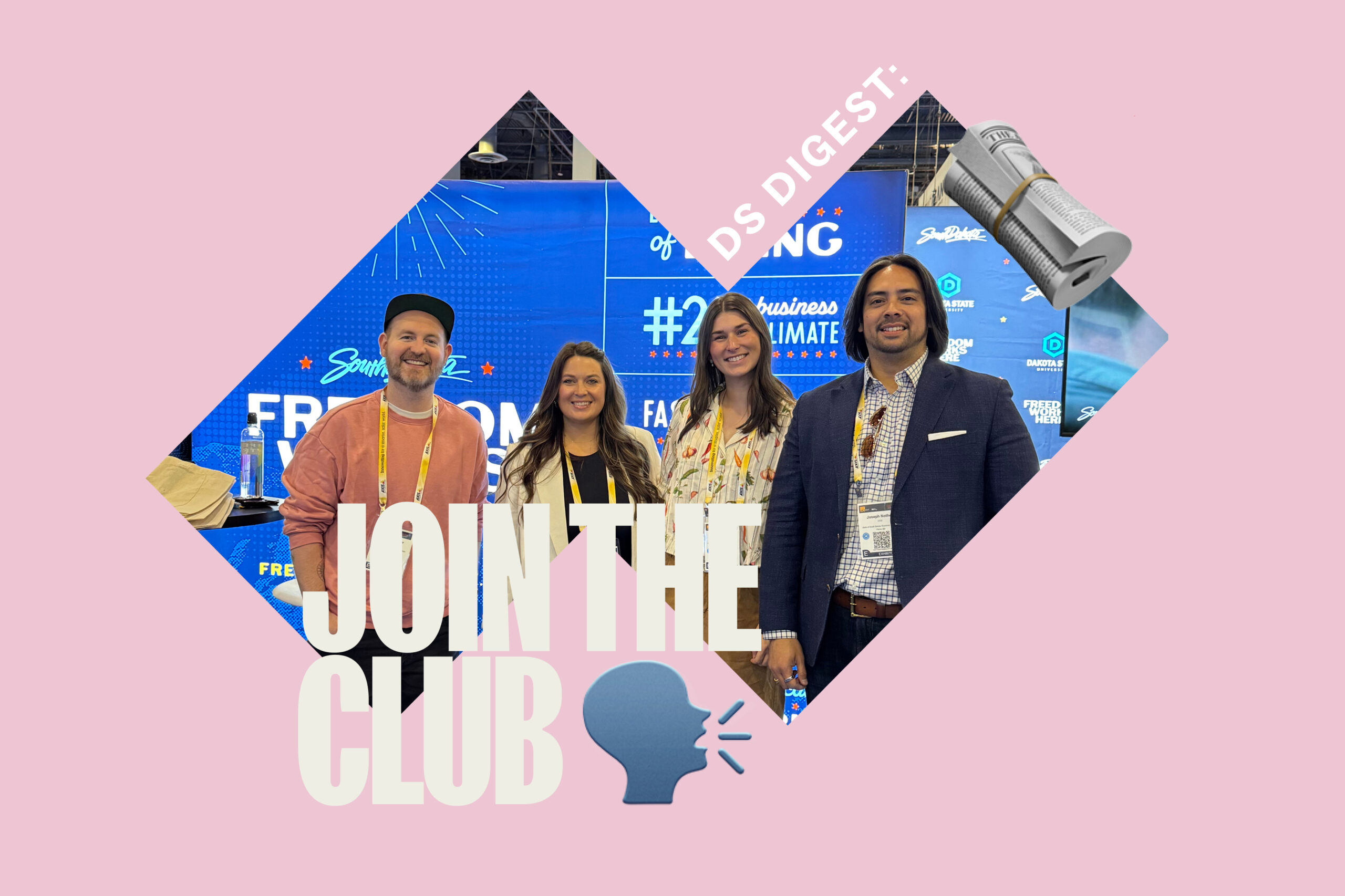
First stop: ISC West in Vegas, where we joined forces with the South Dakota Governor’s Office of Economic Development to spotlight the state’s powerhouse cybersecurity operations. While there, the team couldn’t resist swinging by CinemaCon because, let’s be honest, you can’t keep any of us away from the movies.
We also teamed up with our friends at Arrowmont for NCECA, the big annual ceramic arts conference. We helped amplify their incredible workshops and programming through a new booth design, giving clay its well-deserved moment in the spotlight.
Launched by our Director of Branded and Original Content, Madelyn Cunningham. It’s a behind-the-scenes dive into the chaos and craft of reality TV, featuring creators, casting directors, and showrunners who make the he-did-not-just-say-that magic happen. Whether you binge Survivor or just want to know how the sausage gets made (sometimes literally), this one’s for you.
It’s wrapping its third season in Big Orange fashion. If you haven’t tuned in yet, now’s the time to get caught up with your favorite Vols.
📍 New Billboards Near You
We’re officially live with our latest paid media campaign for Covenant Health. With these strategic placements, this one’s built to be seen—and it is. If you’ve spotted a Covenent Health billboard while scooting through traffic on your way home, yep, that’s us. We’re driving awareness, impact, and a whole lot of impressions.
Apparently, we’ve got a serious case of wanderlust at DS. This spring, it’s a full-on world tour for our team: cross-country drives that’ll test your Spotify playlists, hikes in Patagonia that’ll test your lung capacity, a honeymoon in Japan that’ll test your chopstick skills, and… Disney.
Because balance, right? Back here in Knoxville, though, we’re taking all that inspiration—the sights, the sounds, the jet lag—and channeling it into whatever crazy, creative thing comes next.
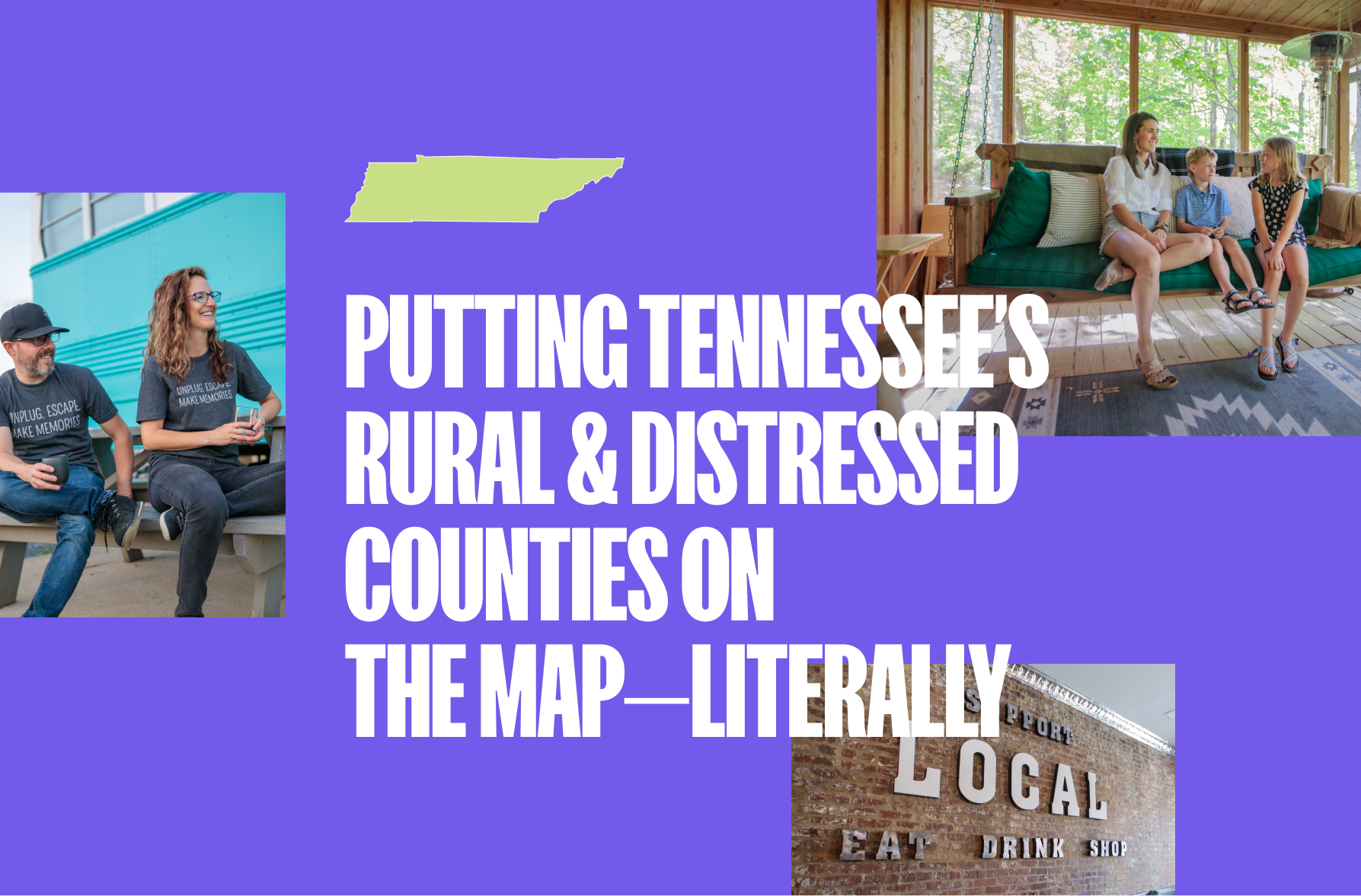
Some wins are easy to measure—clicks, conversions, impressions. Others are felt more deeply in ways that go beyond data points. Our recent work on the Rural & Distressed County production project for the Tennessee Department of Tourist Development (TDTD) is one of those wins that resonates far beyond the numbers. It’s about impact. It’s about changing the trajectory of communities. At the 2025 Blizzard Conference in Franklin, TN, that impact was on full display.
Attendees, including tourism professionals from across the state, industry partners, and TDTD leaders, showered praise on the work our team has done over the past few years. They weren’t just pleased with the creative—though the photos, videos, and branding certainly made an impression. They were talking about real, measurable change.
From “Distressed” to Dynamic
When we began this initiative three years ago, over 35 counties were classified as rural and distressed. These were places struggling to attract visitors, businesses, and investment. Our goal, alongside TDTD, was to help these counties tell their stories through dynamic photo and video assets—giving them the tools they needed to be seen, to be discovered.
Fast-forward to 2025, and only 9 counties remain on the distressed list, surpassing the state’s goal of bringing that number down to 10 by this year. That’s not just movement—it’s transformation.
Stories of Impact
One standout example is Hickman County. Before this project, Centerville in Hickman County didn’t even have a tourism website. Today, they not only have an online presence but have leveraged the photography and video content we created to build a compelling destination brand. The result? A surge in tourism investment and new attractions. In fact, Hickman County Chamber of Commerce Executive Director Marcia Alexander couldn’t stop expressing her gratitude for the work and the relationships built along the way. They’re already discussing additional content creation to showcase even more growth.
Then there’s Carroll County, a place that once questioned whether they had anything to offer tourists at all. Our video work changed their perspective—and their trajectory. Now, we’re wrapping up a visual identity and wayfinding project, born from their enthusiasm and belief in what’s possible.
Advertising You Can’t Buy
This kind of organic success is rare. The work we’ve done—partnering with these communities to uncover their unique stories—has turned curiosity into visits, visits into economic growth, and growth into long-term sustainability. It’s the kind of advertising money can’t buy, and it’s a testament to what happens when strategy, creativity, and purpose align.
That’s what we aim to do every day. To Melanie Beachamp and her team at TDTD, we couldn’t have done this without your hard work and additional efforts to drive this program, and our state, forward. To everyone on our team who played a role in this effort—including our sister company PopFizz, who shot these amazing assets—the win is yours. Your work has made a lasting difference, and the impact is only beginning.
Web development often feels like an entirely different language. Whether you’re a client trying to understand a project, a new developer finding your footing, or someone curious about how the digital world works, learning these terms can bridge the gap between confusion and clarity.
In this post, we’ll define 20 essential terms that every web development enthusiast or professional should know. Consider this glossary your go-to resource for demystifying the jargon of our industry.
The Terms You Need to Know
1. API (Application Programming Interface)
An API is a set of rules that allows different software applications to communicate with each other. For example, APIs enable websites to pull in data from other sources, like embedding Google Maps into a contact page.
2. Responsive Design
This is the practice of designing websites to adapt to various screen sizes and devices, ensuring an optimal user experience whether you’re on a smartphone, tablet, or desktop.
3. SEO (Search Engine Optimization)
SEO refers to the techniques used to improve a website’s visibility in search engine results. From keyword optimization to site speed, SEO ensures that your site ranks higher and reaches more users.
4. CMS (Content Management System)
A CMS is a platform, like WordPress or Drupal, that enables users to create, edit, and manage website content without needing extensive coding knowledge.
5. Accessibility
Accessibility involves designing websites to ensure they can be used by everyone, including people with disabilities. This includes features like alt text for images, keyboard navigation, and screen reader compatibility.
6. Frontend Development
Frontend development focuses on the visual and interactive parts of a website—the side users see and engage with. It includes technologies like HTML, CSS, and JavaScript.
7. Backend Development
Backend development is the server-side of a website, where data is processed, stored, and managed. This includes working with databases, servers, and server-side programming languages like PHP or Python.
8. HTTPS (HyperText Transfer Protocol Secure)
HTTPS is a protocol for secure communication over the internet. It ensures that the data exchanged between a user’s browser and a website is encrypted and secure.
9. Cache
A cache is a temporary storage area that speeds up the loading of websites and applications by storing frequently accessed data locally on your device.
10. SSL (Secure Sockets Layer)
SSL is a security protocol that encrypts the data exchanged between a user’s browser and a website. This is what makes the little padlock icon appear in your browser’s address bar.
11. DNS (Domain Name System)
DNS translates human-friendly domain names, like designsensory.com, into IP addresses that computers use to identify each other on the internet.
12. Web Hosting
Web hosting is the service of storing website files on servers that are connected to the internet, making your site accessible to users.
13. UX/UI (User Experience/User Interface)
UX focuses on how users interact with a product and how enjoyable that experience is, while UI is about the visual elements and design that users interact with.
14. Version Control
Tools like Git allow developers to track and manage changes in code, ensuring that updates and revisions are easily accessible and manageable.
15. Open Source
Open-source software is freely available for anyone to use, modify, and distribute. Popular examples include WordPress, React, and Linux.
16. Sitemap
A sitemap is a file that provides search engines with information about the structure and content of your site, helping improve its crawlability and SEO.
17. Framework
A framework is a collection of pre-written code that provides a foundation for building software applications. Examples include Bootstrap for frontend design and Laravel for backend development.
18. Agile Development
Agile is a method of software development that emphasizes iterative progress, teamwork, and adaptability. It’s all about delivering functional pieces of a project incrementally.
19. Microservices
This architectural style structures an application as a collection of small, independent services that can be developed and deployed separately.
20. CDN (Content Delivery Network)
A CDN is a network of servers distributed across multiple locations. It delivers content to users faster by serving it from the server closest to them.
Why These Terms Matter
Understanding these key terms can help you navigate the world of web development more effectively. For clients, it means better communication and collaboration with developers. For developers, it’s about building a strong foundation of knowledge to create better, more efficient systems.
At Designsensory, we believe that empowering our clients and team members with knowledge is crucial to creating innovative, impactful digital experiences. If you have questions about any of these terms or want to learn more, don’t hesitate to reach out—we’re here to help translate the language of web development into success for your project.
Twenty-three years ago, we set out to build something different. Designsensory started as two guys with a vision—to challenge the status quo, to solve the unsolvable and to create work that actually mattered.
We saw too many agencies delivering forgettable work, hiding behind layers of process and ego. We knew there had to be a better way.
We built Designsensory on a belief that creativity, strategy and technology—when fused together—could create undeniable moments of truth. Not just pretty campaigns. Not just analytics reports. But work that sparks action and drives results. That belief has carried us through 23 years, 17 iPhones and countless campaigns. And it remains unchanged today.
Evolving Without Losing Ourselves
From the beginning, our journey has been fueled by relentless curiosity, a drive to do things differently and an all-star team of unicorns who never settle for good enough.
We’ve grown from a two-man shop into a 35-person powerhouse, pushing boundaries for brands that refuse to blend in.
Every year, every challenge, every shift in the industry has only reinforced our core mission: help our clients stand out and make a real impact.
Today, we unveil a new evolution of Designsensory. A rebrand, but not just a fresh coat of paint, a declaration of who we are and where we’re going. Sharper, bolder, and more powerful, it’s an expression of our commitment to sparking radical change for our clients. It’s the visual and verbal embodiment of what we’ve always believed: no fluff, no filler, just work that demands attention and delivers results.
Our visual identity has been refined to reflect our energy and ambition. Our new website is laser-focused on what we do best, cutting through the noise and showcasing the impact we create. And our messaging? We’re cutting through the jargon and speaking with the clarity and confidence that has always defined us. No ego. No B.S. Just a shared drive to win—together.
The Next Chapter
This rebrand isn’t just about Designsensory. It’s about the brands we partner with, the businesses we help grow, and the people we inspire. The next chapter is about pushing harder, thinking bigger and continuing to challenge everything we thought we knew. We’re just getting started.
To our clients, partners, and team—thank you. Choosing an agency is an act of trust, and we don’t take that lightly. Your belief in us fuels everything we do. For 23 years, you’ve allowed us to push boundaries, rethink what’s possible and build something that lasts. And we’re ready to do it all over again.
Here’s to what’s next. Let’s make it unforgettable.