Author: Ilana Stark

The Science Behind the Scroll: Why Your Content Gets Scrolled Past (And How to Fix It)

Posted on by Ilana Stark

You have 0.05 seconds to make a first impression on a website, and 1.7 seconds to grab someone’s attention on social media. We’ve all been there – spending weeks brainstorming, scripting and perfecting a piece of content, only for users to breeze past in a millisecond.

It’s a brutal reality. The average human travels approximately 300 feet down a vertical screen daily, which is the height of the Statue of Liberty. This isn’t active engagement; it’s a state of continuous autopilot. 

To fight this, many brands aim to scream louder by adding chaotic edits, flashing captions, jarring noises to “stop the scroll” or really attempt to hijack your attention. But the truth is, consumers have developed immunity to digital shouting and are quick to deem a post watch-worthy or not. If you want to win the feed, and the end user, you don’t have to stop the scroll – you just have to redirect its momentum. This principle is universal, applying equally whether you are producing organic content or running paid ads. The autopilot brain does not look for a “Sponsored” label before deciding to swipe. It screens out cognitive friction and predictable patterns indistinguishably. However, while organic content wins by feeding a user’s digital identity, paid social ads must go a step further to convert that brief moment of captured attention into immediate engagement and purchase behavior. 

Social media is a unique marketing channel because it promotes two-way communication, and when consumers trust a brand, they’re more likely to engage with content, even if its persuasive capabilities are low.

Here is how to use behavioral insights to move people past the swipe and get them to actually care. 

Users Gamble on the Next Post… You Don’t Have To 

The psychological engine behind an algorithm is a variable-reward schedule, which is the exact same mechanism used with slot machines. We keep scrolling because brains are addicted to the anticipation of what comes next. Whether it’s a “premium” post, an update from a beloved creator, or just a great meme, the brain is literally gambling on the next piece of content. 

When your content opens with a predictable corporate logo or a generic, staged stock photo, the user’s brain immediately predicts the outcome: This is an ad. It will require effort. It will be boring. The thumb swipes up before the conscious mind even processes the message.

So, how do you become the creative fix?

Violate pattern recognition and break the script in the first two seconds — create a strong hook. A great hook doesn’t just stop a wandering eye— it primes the brain for exactly what is to come. Hooks can come in the form of  the title and thumbnail of a high-performing YouTube video, an unskippable headline on an investigative article, the first few seconds of a Reel, or even the first sentence on a LinkedIn post or X thread. It sets expectations and promises value. We’re in the Hook Economy.

Whether it’s a paid ad or an organic post, if a user can’t understand your core takeaway or what value they’re getting from the post within a single glance, your opportunity has already passed. Sometimes, less is more, and keeping messages concise might be the key to structuring engagement behavior. 

When they become curious, you’ve won their attention. 

Design for Autopilot 

The moment an autopilot brain encounters something it has to strain to understand, it flees and refuses to do the heavy lifting. There’s no desire to analyze an article, be a logic-driven individual, or watch a 10-minute video. Without constant concentration, consumers rely entirely on emotions, familiarity and trust to process the world. 

Using a non-traditional hook makes them pause and think, “Wait, what is this?” It has the power to bypass the reflex that tells the brain to scroll past, prompting it to risk investing time into a deeper video or article. This works because when content promises a high-value return with low mental effort up front, it tricks the brain out of its energy-saving mode. By lowering the initial effort of processing information, the subconscious mind has a compelling reason to hand control over to the conscious, analytical mind.

  • Visuals First: Use highly recognizable human expressions, experiences and clean layouts that require zero mental strain. When creating hook-specific visuals, this means immediately breaking visual cycles within the first 1.7 seconds to disrupt pattern recognition. Instead of polished, predictable graphics, use native text styling, sudden perspective shifts or high-contrast visual anomalies that feel raw and true to the platform. The goal is to design a visual such as an unexpected close-up, a rapid cut or a text overlay that mirrors the format of user-generated content so the autopilot brain can’t instantly classify your asset as an ad and filter it out as commercial white noise. Hook specific images visually solve a problem to build curiosity before viewers learn anything at all. 
  • Simplify the Hooks: Creating content that sends a brand or product to the top of mind does not have to be overcomplicated. Sparking consumer curiosity and being memorable is simple, but not easy. In cognitive psychology, this relies on a mechanism known as processing fluency – the ease with which the human brain digests and understands incoming information. When a message requires less processing power, the brain experiences a state of “cognitive ease.” This ease is crucial because audiences subconsciously mistake processing speed for credibility and truthfulness. To build immediate top-of-mind recall, your hook must reduce cognitive load by eliminating industry jargon, avoiding abstract metaphors and delivering a clear, singular promise before the user can choose to swipe away. 

The goal is to stand out and be easy to remember. Prioritizing hook techniques, like information quality and impact, allow “quality over quantity” to take over. From there, messages are easily retained and customers will pause autopilot to learn more. 

  • The Sequence: Emotion captures the autopilot brain, and logic justifies it later. Triggering an instant emotional response or visual curiosity first will spark a justification of the watch, the save, or the purchase decision.  

Brand Ego → Digital Identity

Why do people double-tap, comment on, or share a piece of content? It’s never because they simply love a corporate entity and want to help it achieve its quarterly goals. They engage because of algorithms and social currency. Every piece of content a user interacts with is placed as a digital brick in their own online identity and their media diet.

When a user shares your post to their story or tags someone else, they are – at their most basic level – implicitly telling their network, “Look at this – this aligns with how smart, funny, cultured, passionate, or in-the-know I am.” 

By shifting the perspective of the post, frame your insights so viewers can adopt them as their own personal traits. Instead of saying, “Look how smart our organization is,” you’re saying, “Here’s a foundation that makes you feel and look like an expert when you talk to your team tomorrow.” 

Stop making your logo the hero of the story: make your audience the main character. 

Don’t Guess. Start Engineering. 

Creative instinct is the backbone of advertising, but in a crowded marketplace where every brand is fighting for screen time, relying only on a hunch is no longer good enough. Producing content based solely on what feels creative, without taking into account the hard realities of human behavior and biases, is just donating marketing dollars to the algorithm.

To turn doom scrollers into active brand representatives, higher ad spend and flashier graphics aren’t technically the answer. Deeper, more intentional understandings of humans on the other side of the screen set organizations apart and allow them to connect and persuade. 

Combine cinematic narratives with behavioral insights to build campaigns that don’t just sit passively on a feed – they command the actions. 
The Loyalty Moat

Posted on by Ilana Stark

Here’s something most marketers know, but don’t always act on: keeping a customer is almost always cheaper than finding a new one. 

The data has been clear on this for years. And yet, so many businesses still pour the bulk of their budget into acquisition while their existing customers quietly drift away.

A well-built loyalty program changes that equation. It closes the loop with repeat customers, strengthens the emotional connection people feel toward your brand, and creates a kind of defensive moat around your business. When a customer inevitably has a bad day with you—a delayed shipment, a confusing return, an off-brand interaction, a string of new releases that don’t resonate with them—that loyalty buffer is what keeps them from walking out the door for good.

But here’s the real risk. Most loyalty programs don’t actually earn loyalty. They earn transactions, and there’s a big difference.

The culprits are usually the same: sameness, staleness, and superficiality. If you want customers to feel genuinely rewarded, you have to genuinely reward them. Here’s how to do it.

The Small Business Advantage (Yes, You Have One)

Big brands have big budgets. But small and mid-sized businesses have something more valuable in the loyalty game: agility. You can move faster, get more personal, and make decisions that a 12-layer corporate approval chain would never allow.

There are plenty of solid platforms out there to build the technical backbone of a loyalty program. Use them. But don’t mistake the platform for the strategy. The platform is just the tool. What you do with it—how you make your customers feel—is the strategy.

That’s where smaller operators consistently outperform their larger competitors, when they choose to.

The Strategy: Personalization + Participation

In transmedia campaign thinking, we often talk about the “Four P’s”: Personalization, Participation, Platform, and Performance. For loyalty programs specifically, the first two are where the magic happens.

  1.  Personalization: Know Your Customer, Not Just Their Spend

Most loyalty programs reward based on how much a customer spends. That’s fine, but it’s also the floor, not the ceiling. The real opportunity is in using transaction history to understand what actually matters to that individual—and building rewards around that.

A few ways to do this well:

Tier your rewards meaningfully. There’s a real difference between a casual, occasional shopper and someone who sends five referrals a year and posts about you unprompted. Your program should reflect that difference—not just in point totals, but in the kind of recognition they receive.

Think beyond discounts. Discounts are easy to copy. Access isn’t. Consider what you can offer that money can’t easily buy elsewhere, like early product releases, behind-the-scenes glimpses, VIP events, or a direct line to someone who actually answers. These kinds of rewards create emotional resonance that a 10% off coupon simply can’t.

Segment by behavior, not just spend. A customer who buys once a month and always leaves a review is valuable in a different way than a high-spender who never engages. Your program should be sophisticated enough to recognize both.

  1. Participation: Keep Customers Engaged Between Purchases

One of the trickiest challenges in retention is the gap. The time between purchases when a customer has no particular reason to think about you. Participation-driven strategies are specifically designed to fill that gap.

Gamification and micro-rewards offer smaller, more frequent moments of value. Think: a badge for leaving a review, points for completing a profile, a surprise reward on a customer anniversary. None of these moments are huge on their own. But together, they build a rhythm of engagement that keeps your brand top of mind.

Exclusive content is perhaps the most underused tool in the loyalty toolkit. When done right, it transforms a transactional relationship into something closer to membership. You’re inviting them into something, as opposed to meaningless and often worthless points.

When we worked with a leading NIL (Name, Image, and Likeness) collective for a top SEC program, we produced exclusive video content in the form of coach and athlete interviews, behind-the-scenes access, which was made available early and only within their membership app. Engagement improved. Not because we spent more money, but because the reward was something that couldn’t be bought anywhere else. It was genuine access and insight. That’s the standard worth chasing.

Don’t Let Friction Undo Your Work

You can build the most thoughtful loyalty program in your industry and still lose if the experience of using it is confusing or clunky. UX isn’t a nice-to-have here—it’s load-bearing.

The process should be transparent. Customers should always know where they stand. How many points they have, what they’re working toward, and exactly how to redeem what they’ve earned. It should feel good to earn and even better to spend.

Friction is the enemy. Every extra click, every confusing redemption flow, every “why won’t this work” moment is a small invitation for your customers to forgo redemption, which leads to them reconsidering the effort they put in and, ultimately, their loyalty. Simplicity, on the other hand, deepens the moat. It keeps customers engaged because the experience of being a loyal customer is enjoyable in itself.

Loyalty Is a Feeling, Not a Function

Here’s something the platforms won’t tell you: the most effective loyalty programs aren’t primarily about points. They’re about identity. The best ones make customers feel like they belong to something—a community, a movement, a story they’re proud to be part of.

Think about the brands you’re personally loyal to. Chances are, it’s not because of a reward chart. It’s because of how they made you feel. Seen, appreciated, and like an insider, rather than just another transaction.

That’s the standard worth building toward. And it’s more achievable than most businesses think, especially for smaller operators who can actually know their customers by name.

Some practical ways to build that emotional layer:

  1. Acknowledge milestones that matter to the customer (anniversaries, birthdays, tenth purchase) with something personal.
  2. Solicit input from your most loyal customers before making changes. Make them feel like co-owners of the experience.
  3. Surprise and delight occasionally, unpredictably. Unexpected generosity is remembered. Expected rewards are just expected.

Is Your Loyalty Program Stuck on Autopilot?

A stamp card isn’t a loyalty program. A points balance that no one ever redeems isn’t a loyalty program. A generic email blast to your “valued customers” isn’t a loyalty program.

A loyalty program is an ongoing promise: that you see your customers as more than a revenue source, that you’re paying attention, and that their continued business means something to you.

If you make people feel like their loyalty actually matters, they’ll return the favor. Build an ecosystem that rewards the customer for being part of your story—not just for swiping their card.

Your best customers deserve more than a generic stamp card. Let’s figure out how to turn them into your most powerful brand advocates.

PR in an AI World

Posted on by Ilana Stark

Artificial intelligence (AI) is changing how we work, quickly and in very real ways. In communications, it’s already embedded into how we draft, research, and produce content. It can summarize information in seconds, generate a first draft in minutes, and accelerate workflows that used to take hours.

But here’s the tension we’re all navigating: AI makes content faster. It does not make it more credible.

And in my world, where reputation, trust, and public perception are the outcomes, that distinction matters.

Speed vs. Judgment

I work at the intersection of strategy, storytelling, and reputation. My job isn’t just to create content, it’s to ensure that what we put into the world is believable, aligned, and trusted. AI plays a role in that process, but not the role many assume.

I think about it simply:

  • AI = speed 
  • Human = judgment 
  • Outcome = trust 

AI helps me move faster. It does not, and should not, make the final call. After all, just because something is created quickly doesn’t mean it’s right, and it definitely doesn’t mean it will resonate.

Where AI Actually Adds Value

Used well, AI is an incredibly effective assistant.

In my day-to-day work, that looks like:

  • Drafting early versions of press releases 
  • Summarizing background materials 
  • Compiling research 
  • Brainstorming angles 

For example, I might prompt AI to generate a first draft of a press release based on a set of inputs. It gives me a starting point quickly, something structured, something usable. But that draft is never the final product. It gets rewritten, refined, and pressure-tested against audience, tone, and real-world context. At the end of the day, the difference between content and communication is intent, and that requires human judgment. 

The Risk: “Confident but Wrong”

One of the most overlooked risks of AI is how convincing it sounds. AI can generate content that reads as polished, authoritative, and definitive. But you should not presume AI’s confidence and accuracy are one in the same. 

AI can misstate facts, generalize nuance, and flatten a brand’s voice into something generic. When everyone uses the same tools the same way, the output starts to sound the same. That’s not just a creative issue; it’s a credibility issue.

At Designsensory, we treat AI outputs as drafts, not decisions. Everything is reviewed, validated, and refined by a human before it reaches a client or the public. 

Where Humans Still Lead

I think about AI usage through the lens of risk.

  • Low-risk tasks (i.e. drafting, research, summarization): AI can lead. 
  • High-risk tasks (i.e. reputation management, messaging, trust): Humans must lead. 

If it touches public perception, brand credibility, or stakeholder trust, it requires experience, instinct, and context. That’s especially true in crisis communications where tone, timing, and nuance matter just as much as the words themselves.

AI can support the process. But it should never own the outcome. 

The Shift That Matters Most

What we’re seeing now isn’t just a change in tools, it’s a shift in where value lives. 

AI can generate content, and so, the real differentiator becomes what should be said; how it should be said; and why it matters. In other words: strategy and storytelling. The future isn’t about who can create the most content. It’s about who can create the most meaningful content.

The Skills That Will Stand Out

For professionals entering this space, the takeaway isn’t to avoid AI, it’s to use it intentionally.

The most valuable skills aren’t being replaced. They’re becoming more important:

  • Strong writing 
  • Strategic thinking 
  • The ability to ask better questions 

AI can generate answers, but it still depends on humans to define the problem.

If there’s one principle I come back to, it’s this: Use AI to enhance your work, but never let it replace your judgment. AI increases efficiency. It does not increase credibility. And in a landscape where trust is harder to earn and easier to lose, that distinction isn’t just important – it’s everything.

How to Get Maximum Output and Impact from Your Production Shoots

Posted on by Ilana Stark

By Kristin Majni, Director of Operations, Popfizz

Let’s be honest — for most business owners, hiring a production team feels a little like buying a car where the engine is invisible, the paint color changes halfway through the build, and every mechanic quotes you in a different currency. It’s high-stakes, it’s confusing, and it’s expensive to get wrong.

But here’s the good news: if you walk into that first conversation prepared, you stop paying for “art” and start investing in assets. Here’s how to navigate the production landscape without getting taken for a ride.

Stop Briefing “Vibes.” Start Briefing “Value.”

When you tell a production company, “I want it to look like a Nike ad,” you’ve told them nothing about your business. You’ve just told them you have expensive taste.

The shift is simple but powerful: instead of saying “I need a video,” say “I need to reduce my Customer Acquisition Cost on Meta” or “I need a content partner for organic Instagram, and I want to explore TikTok.” That single reframe changes the entire conversation — and the kind of partner you attract.

Our co-founder Joseph Nother puts it well: “If the production company doesn’t ask you where the video is going to live, how you want to use it, or who is supposed to click it — they’re artists, not partners. You want both. Art and science. Artist and partner.”

That’s your litmus test. Use it.

The Bid Trap: You’re Not Comparing Apples to Apples

You’ll get three quotes: one for $5k, one for $25k, and one for $75k. Most marketing directors and business owners default to the middle option or the cheapest. The problem is you’re likely comparing a freelancer with a camera to a fully insured agency with a post-production team behind them.

Before you pick based on price, normalize the bids with three questions — ask every single bidder:

1. Is licensing included? Don’t find out the hard way that the song in your video wasn’t cleared, or that the talent release didn’t cover paid ads. Ask upfront, and get it in writing.

2. What’s your revisions policy? Standard industry practice is two to three rounds:

  • Round 1 (Rough Cut): Major structural changes
  • Round 2 (Fine Cut): Small tweaks and polish
  • Round 3 (Approval Cut): Final sign-off

Here’s the red flag: if a company offers “unlimited revisions,” walk away. It doesn’t mean they’re generous — it means they don’t have a process, and they’re expecting the project to be a mess. You want a partner who respects your time enough to push for a decision.

3. Who owns the raw files? Some companies hold your own footage hostage after the project wraps. Make sure ownership of the raw files is spelled out clearly in your contract before you sign anything.

One more thing on budget: if you’re spending $100k on a video and $0 on paid distribution, you haven’t bought a marketing tool. You’ve bought a very expensive paperweight. As a rule of thumb, reserve 30–50% of your total project budget for distribution and paid amplification.

The Content Harvest: One Shoot, Multiple Platforms

Here’s where most brands leave serious value on the table.

The most expensive part of any production is getting people, lights, and cameras in the same room. Once you’re there, the marginal cost of capturing extra footage is minimal. So don’t just ask for a “commercial.” Ask for a content library.

Think about it this way — a single shoot can yield:

  • The Hero (16:9) — Website and YouTube. Your brand’s front door.
  • The Shorts (9:16 or 3:4) — TikTok and Reels. High-frequency, low-cost organic reach.
  • The Mutes — LinkedIn and Facebook. Around 80% of people scroll with the sound off. You need captions baked in, not added as an afterthought.
  • The Stills — Web and email. Have your photographer grab high-res shots during lighting setups. You’re already lit — use it.

One production day, built smart, can fuel your content strategy across every channel for months.

Production Partner vs. Vendor: Know the Difference

This one is worth paying attention to.

A vendor says: “Our shoot includes a :60, a :30, and a :15 edit.”

A partner says: “We’ll cover all your target channels. We’ll frame everything so we can crop for each platform, and we’ll film three different opening hooks to test which one converts better.”

Hire the person who cares about your conversion rate as much as your color grading.

Your Filter for the Next Production Call

Before you end any discovery call with a production company, ask them this:

“We have a $X budget. How would you split that between creative execution and the assets we need for our paid media funnel?”

Their answer will tell you everything you need to know.

Want to dig deeper into getting maximum impact from your next production shoot? We’d love to talk.

Trends and Strategies Shaping the 2026 Beverage Landscape

Posted on by Ilana Stark

What works in healthcare or financial services may or may not work in CPG. There are just as many differences as similarities when you go category to category — which is exactly why doing the deep dive matters. Events like the Beverage Forum exist for this reason: to connect a community around the best practices that actually apply to your world.

That said, one thing holds true no matter the category. From brand building to performance marketing, the playbook for how to start a brand is fundamentally different from how to scale it. Designsensory helps brands figure out what’s next.


If there’s one thing the latest Beverage Forum made clear, it’s that drinks are having a moment. 

While the broader economy has people watching their wallets, the beverage category keeps climbing — and it’s not just luck. Something deeper is happening: people have started treating what they drink the way they treat what they eat, as a real investment in how they feel and function.

Here in 2026, a few big themes are reshaping who wins and who gets left on the shelf.

1. Drinks That Actually Do Something

The era of the empty-calorie beverage is quietly fading. Shoppers are getting pickier, and they want something in return for their $4 or $6 or $12. That means protein, creatine, and electrolytes for recovery. Collagen, fiber, and probiotics for everyday wellness. Adaptogens and mood-boosting ingredients for the mind.

Retailers have noticed. Shelf space that once belonged to sugary staples is being reassigned — fast. And if you want the boldest prediction for 2026, it’s this: hormonal health is about to have its moment. Expect a wave of new products specifically designed around endocrine support and hormonal balance. It’s still early, but the runway is real.

2. Know Your Retailer (They’re Not All the Same)

Getting a product onto shelves used to be mostly about volume and price. Not anymore. Each major retailer has a distinct personality, and brands that don’t match the vibe tend to struggle.

For example, Sprouts is the nurturing one; they actively guide emerging clean-label brands and give them room to grow. Walmart, maybe surprisingly, is more open than people assume, as long as you can scale fast. Target is the tough one — their bar is high, and they have a very specific idea of who their shopper is. Hy-Vee and Albertsons are more democratic about it, essentially letting shoppers vote with their purchases to determine what stays.

The takeaway: before you pitch, know the room.

3. Getting Past the Sophomore Slump

A lot of brands nail their launch and then hit a wall. The initial buzz fades, the early adopters move on, and suddenly the sales chart isn’t looking so exciting. That’s the “sophomore year” problem, and it’s where a lot of promising brands quietly die.

The ones that make it through have a few things in common. They’ve figured out how to turn first-time buyers into regulars. They use smart, targeted marketing — increasingly AI-driven — to show how their product actually fits into someone’s daily life. And they keep their messaging simple. People don’t want a chemistry lesson; they want to know what it does for them.

This same logic applies to celebrity partnerships. A famous face still opens doors, but the “launch it and leave it” era is over. If the celebrity isn’t genuinely showing up for the brand over time, the novelty wears off fast. Authenticity isn’t optional anymore — it’s the whole game.

4. Brands Worth Watching

A few names are doing the 2026 playbook particularly well right now:

Goodboy Vodka is making the jump from regional hit to national RTD contender by leaning hard into cause-driven branding (“Every Pour Helps a Pup”) and creating the kind of unpolished, high-energy event content that actually gets shared.

Stateside Brands (Surfside) has carved out a niche in the no-carbonation space and is building a $20M entertainment hub — Stateside Live! — that essentially turns their brand into a destination.

Milo’s Tea holds nearly 40% market share by staying loyal to a clean, homemade identity while quietly building the infrastructure to support serious scale.

Lifeway Foods is parlaying its kefir reputation into the performance space with products like Muscle Mates™ (protein + creatine) and is smartly positioning dairy as a natural companion for people on GLP-1 medications.

Gratsi Wines is taking on boxed wine’s image problem not by defending the format, but by selling an entire lifestyle — the Mediterranean good life, distilled into a box — under the hashtag #GratsiLife.


In 2026, being a good beverage product isn’t enough. The brands that break through are the ones that feel like part of someone’s life — something they’d miss if it disappeared. Whether that means geofenced local campaigns or scrappy behind-the-scenes content, the goal is the same: go from something people pick up once to something they ask for by name.

Are you building for launch or building for longevity? Designsensory helps you build what’s next. Give us a call.

The Brand Equation: How Customer Feelings Create Financial Value.

Posted on by Ilana Stark

Let’s be clear: when we talk about “brand,” we’re just talking about a logo or a tagline. Well, we are. But that thinking is small and dated. Branding started with farmers branding cattle to prove ownership, but in a market this crowded, a brand is what separates you from the noise. It’s the difference between a generic product and something people actually want. It’s the feeling of unboxing an Apple product or the baseline trust in Tylenol.

The goal is to build value that goes way beyond the physical product.

The Kinds of Brand Value

People don’t just buy what a product does; they buy what it means. A strong brand delivers on multiple fronts:

  • Functional Value: Does the thing work? This is table stakes. A generic pain reliever and Tylenol both fix a headache. You don’t win on this alone.
  • Emotional Value: How does the brand make people feel? Jeep feels rugged and free. Mercedes feels like you’ve made it. These feelings drive decisions.
  • Experiential Value: This is every single touchpoint. The UI on your banking app, the in-store vibe, the way the product is packaged. It all adds up to a memorable (or forgettable) experience.
  • Identity Value: What you buy signals who you are. Buying Allbirds says you care about sustainability. A luxury watch signals success. Brands become part of a person’s story.
  • Social Value: Brands can build communities, or “tribes.” Think about sports fans, online gaming forums, or a running club sponsored by a sneaker brand. It creates a sense of belonging.
  • Relational Value: This is about trust. Does the brand act like a reliable partner? Think of your bank or a tool brand that’s never failed you.

Identity vs. Image: Your Plan vs. Reality

To manage a brand, you have to know the difference between what you’re pushing out and what the customer is actually picking up.

  • Brand Identity is your strategic plan. It’s the name, logo, stories, and values you intend to project. It’s the lens through which you want the world to see your product.
  • Brand Image is the reality. It’s how consumers actually see the brand, based on their experiences, word-of-mouth, and whatever they see on social.

Our job is to close the gap between the two.

So, How Do You Measure This? (The Two Sides of Equity)

If a brand’s power is in the consumer’s head, how do we measure it? Brand equity is a two-sided coin: one side is what the customer thinks (CBBE), and the other is what the accountants can measure (FBBE).

1. Consumer-Based Brand Equity (CBBE)

This is the side we’ve been talking about—the total sum of what a person thinks and feels about a brand. It breaks down into two main parts:

  • Brand Awareness: This isn’t just familiarity. It’s two things:
    • Recall: Thinking “Coke” when someone says “soda.”
    • Recognition: Seeing the red can and knowing it’s Coke.
    • Top-of-mind awareness is the whole point—being the first brand that comes to mind when it’s time to buy.
  • Brand Knowledge: This is the network of associations people have with your brand—the thoughts, feelings, and beliefs. For brand equity to be strong, these associations need to be:
    • Powerful: Easy to remember.
    • Positive: People actually like them.
    • Distinct: They set you apart from the competition.

Get CBBE right, and you get loyal customers who are less sensitive to price, more willing to try your new products, and more forgiving when you screw up. They become advocates who do your marketing for you. They don’t just buy the brand; they buy into it.

2. Firm-Based Brand Equity (FBBE)

This is the other side of the coin, where all that customer goodwill gets translated into dollars and cents. Firm-Based Brand Equity (FBBE) measures the brand’s value as a separable, financial asset to the firm. If CBBE lives in the customer’s mind, FBBE lives on the balance sheet.

It answers the question: “What is the brand actually worth to the business in financial terms?”

FBBE is the direct result of strong CBBE. Because customers recognize, recall, and feel positively about your brand (CBBE), they act in ways that create measurable financial outcomes for the firm. This includes:

  • Price Premium: The ability to charge more for your product than a generic equivalent.
  • Increased Cash Flow: More people buying your product more often.
  • Lower Customer Acquisition Costs: Your brand’s reputation does the selling for you.
  • Higher Market Share: Winning against competitors.
  • Increased Asset Value: The brand itself can be sold or licensed, adding billions to a company’s valuation.

Think of it as a bridge. CBBE is the foundation on one side of the river (the customer), and true business success is on the other. FBBE is the bridge that connects them. Throughout this series, we’ll explore how to build that bridge, from crafting stories to managing your brand for long-term financial growth.

Next up, we’ll get into brand storytelling—crafting the narratives that build these powerful connections.

LLM Ads Are Coming, Will They Redesign the Customer Journey?

Posted on by Ilana Stark

Advertising works best when context meets intent. For years, the digital marketing industry has operated on the understanding that Large Language Models (LLMs) like ChatGPT are, at their core, high-intent environments. When a user arrives at a chatbot, they usually have a specific need, they are asking for help, and they are already mid-to-low funnel.

It is no surprise that OpenAI is beginning with embedded partners offering simple, low-friction conversions. However, the true disruption lies not in where the ads are placed, but in how they function.

Here is how LLMs are poised to shift the paradigm from display to dialogue.

Compressing the Marketing Journey

The most significant difference between a standard search ad and an LLM recommendation is the compression of the funnel.

In traditional digital marketing, discovery, consideration, and conversion are often fragmented steps across different sites and sessions. LLMs have the potential to collapse this entire journey into a single conversational arc. Because the interface mimics human dialogue, ChatGPT (and Gemini and Claude) doesn’t just wait for explicit intent signals—it can surface brand, product, or service options as contextually relevant answers that emerge naturally.

Why this changes the game:

  • Organic Embedding: Instead of a banner fighting for attention, the product becomes a citable solution within the answer.
  • Predictive Suggestion: By inferring patterns from similar user interactions, the AI can make predictions that feel far more tailored than a static display ad ever could.

In short: The ad unit is the conversation, and the recommendation is embedded organically within it.

The Architecture of Trust (or, The Data Analogy)

If the format is different, is it more convincing? Given the intimate data LLMs hold, the answer is likely yes—but not for the reasons you might think. It isn’t about intrusive targeting; it is about the role of the assistant.

To understand the future of AI influence, we can look to a classic science-fiction analogy: Spock vs. Commander Data.

  • Spock (Star Trek: TOS) represents the trusted friend. His logic helps shape decisions, representing classic word-of-mouth influence.
  • Data (Star Trek: TNG) is the evolution of that role. He is a machine, but a trusted one. He offers precise options, alternatives, and solutions that routinely influence the crew’s choices.

AI will occupy a cultural space similar to Commander Data. The operative word is trust. If users believe the information is verifiable and not manipulative, AI-embedded recommendations can reshape how people discover products. The influence won’t come from ad placement, but from the credibility of the assistant delivering it.

The Ambient Future

This trust becomes even more critical as the interface evolves. OpenAI is exploring voice-only and screenless devices (potentially in collaboration with Jony Ive). If the vision of a “Star Trek-style communicator” comes to fruition in 2026–27, AI becomes a constant, ambient presence.

In a voice-first world, there is no room for a sidebar ad. There is only one answer. This collapses discovery, recommendation, and transaction into a single, agentic moment.

The Bottom Line

LLMs have the potential not just to interrupt the customer journey, but to redesign it.

We are moving toward a future where ads are not perceived as ads, but as helpful solutions delivered by a trusted agent. For marketers, the challenge will be shifting from buying attention to earning relevance within the conversation.

Ready to future-proof your marketing strategy?

The landscape of search and discovery is changing faster than ever. Subscribe to our newsletter today to get the latest insights on AI, marketing ethics, and the new economy delivered straight to your inbox.

The New Playbook of Sports Fandom: 2025 Strategic Report

Posted on by Ilana Stark

The monolithic fan is dead. The sports landscape is fundamentally split into Legacy and Growth Ecosystems, demanding completely different media strategies. This report provides the definitive 2025 blueprint for monetizing modern fandom, detailing the shift to player-first loyalty, the necessity of “shoulder programming,” and the financial opportunity presented by high-growth properties like the WNBA (avid fandom up 65%).

Stop targeting the average fan. Download the report to master the integrated strategy that drives action in 2025.

Funky Fonts & Forward-Thinking Brands: How Playful Typography Sets You Apart

Posted on by Ilana Stark

Close your eyes and picture this: An old-timey paperboy stands at the corner of a bustling city street, shouting, “Read all about it!” He’s holding up a newspaper with a massive, eye-catching headline, and no one can resist a quick glance. In that single moment, the typography does all the heavy lifting—it shouts, “Look at me!” and wins your attention before you ever read a word of body copy.

Fast-forward to today’s digital world. We’re bombarded by brand messages in every feed, on every platform, and across countless devices. The question becomes: How do you stand out? Sometimes, the best way to get noticed is to be a little weird, a little funky, and a lot memorable. That’s where unexpected, playful typefaces come in.

The Case for Quirky Type: Why Weird Sometimes Wins

There’s a time and place for classic typefaces. Fonts like Helvetica, Garamond, or Times New Roman have stood the test of time because of their versatility and timelessness. But as more and more brands look to express a unique personality, safe choices can sometimes be too safe.

Think of it like fashion. A well-tailored black suit will always look sharp, but if you’re trying to turn heads at a big event, maybe it’s time for a vibrant blazer or bold accessories. In branding, your “accessory” might be a surprising typeface—one that breaks the mold of “corporate minimalism” and stops people mid-scroll.

Playful, funky, and even slightly awkward fonts can do a lot of heavy lifting for your brand:

  1. Memorability: People’s minds latch onto novelty. If your font feels fresh or a little offbeat, it sticks.
  2. Emotional Resonance: Typography can evoke mood just like color or music—whimsical curves and playful flourishes can spark joy, curiosity, or excitement.
  3. Brand Differentiation: With countless brands vying for attention, a weird font can be the quickest way to stand out in a sea of sans-serifs.

Of course, it’s not enough to pick a wild typeface and call it a day. You want your typography to support a bigger message about who you are as a brand and what you offer.

UnderConsideration’s Brand New: Where Funky Trends Take Center Stage

If you’re looking for a pulse on what’s shaking up the branding world—especially in terms of interesting and out-there type—UnderConsideration’s Brand New is where you should point your browser. Think of it as a living, breathing newsfeed of brand transformations and identity overhauls.

The folks at Brand New review major (and sometimes minor) rebrands, commenting on everything from color palettes and logos to, yes, typography. Over the years, it’s become a sort of community hub where designers, marketing pros, and brand enthusiasts chime in with critiques or praise for new brand work. And what’s especially cool is seeing how many brands are leaning into unusual, customized typefaces to breathe fresh life into their identities.

By scanning through Brand New’s archives, you’ll notice the rise of expressive lettering and funky design that, a decade ago, might have been dismissed as “too eccentric.” Now, it’s widely embraced if done thoughtfully. The takeaway? If you’re flirting with the idea of unconventional type for your own brand, you’re not alone—and you might just be on-trend.

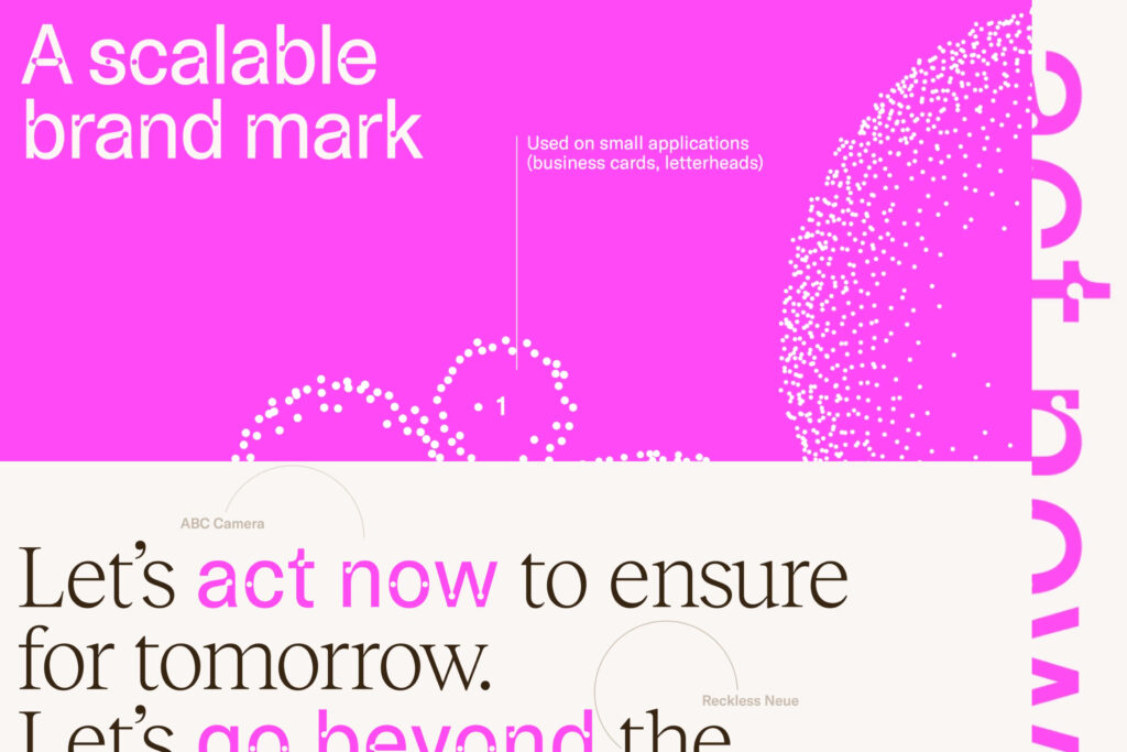
Gush by Pentagram: When Typography Reflects (Liquid) Personality

Let’s take a look at a rebrand that captures this fun, boundary-pushing spirit: Gush, developed by the design powerhouse Pentagram. While the brand itself might not be a household name like Coca-Cola or Apple, it’s a fantastic example of how type can be the real star of a visual identity.

What’s Gush All About?

Gush is a creative platform focused on capturing movement, fluidity, and bold expression. Their identity employs a custom typeface that mirrors the shape and flow of water droplets. The letters feel organic, almost alive, with playful proportions and big, round counters. It’s definitely not your standard minimalistic Gotham or Helvetica clone—and that’s exactly the point.

Why This Works

  1. Brand Messaging: The idea of “gushing” conjures images of waves, liquid, and free-flowing creativity. The typography personifies that concept with letterforms that appear to be in motion.
  2. Memorable First Impression: We’re so used to tight, geometric type that seeing these fluid shapes gives your brain a little jolt. If you see a Gush piece of marketing, you’ll remember it.
  3. Flexibility Across Media: The identity doesn’t just look cool on a website. The watery typeface can be animated, printed, embedded—whatever the brand needs.

Gush teaches us that when your brand story aligns perfectly with a distinctive type style, magic happens. It becomes more than just letters on a page; it’s an experience.

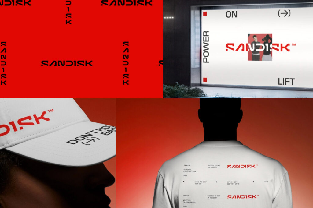
SanDisk’s Refresh: Balancing Corporate & Cool

On the other end of the spectrum is the new SanDisk identity, which made headlines in branding circles for giving a techy, established company a modern facelift. If you’ve ever used a SanDisk memory card, you’re probably used to their simple, recognizable logotype. But as technology evolves, so does the need to stand out in an incredibly saturated market—especially when competing with other memory and storage giants.

The Key Typography Choice

The newly unveiled SanDisk identity leans into unconventional letterforms to express innovation, speed, and a forward-thinking ethos. While still professional enough to suit enterprise clients, you’ll notice some quirky details that break from the old, rigid style. Angles might be sharper, curves might be a bit more pronounced, and certain letters are styled in a way that suggests motion or cutting-edge design.

Why This Matters

  • Differentiation: SanDisk competes with companies like Samsung and Lexar; a more memorable typeface sets them apart on packaging and advertising.
  • Subtle Funkiness: The typeface isn’t outrageous—it’s not full of wild swashes or bizarre ligatures—but it pushes just enough boundary to convey a fresh, updated vibe.
  • Scalability: SanDisk’s brand system is used on everything from microscopic product labels to large trade show banners. A well-designed, distinctive type needs to scale while remaining recognizable.

The result is a perfect compromise between corporate utility and creative flair. It’s a blueprint for how established companies can adopt a bit of funk without alienating their core audience.

Conveying Tone Through Type

So what exactly makes a funky typeface convey a particular tone, and how can you leverage that for your own brand? The secret lies in understanding how each design decision in a typeface can create a visual voice.

  1. Serifs, Sans-Serifs, and Beyond: Serifs can evoke tradition and trustworthiness, while sans-serifs often feel modern and clean. For a funky vibe, consider serif typefaces with exaggerated feet or sans-serifs with playful curves and unusual proportions.
  2. Weight & Contrast: Heavier fonts can feel bolder and more confident. High-contrast letterforms (thin meets thick) can appear elegant or even flamboyant. Think about how these qualities align with your brand message.
  3. Spacing & Alignment: Kerning, tracking, and leading (line spacing) can significantly change how “open” or “tight” your design feels. If you want a breezy, airy vibe, give your letters room to breathe. If you want urgency, tighten it up for impact.
  4. Case Usage & Letter Shapes: All-caps can come across as strong or even shouty. Lowercase can read as friendly or approachable. Mixing it up (small caps, or a single capital letter in an otherwise lowercase word) can add quirkiness without going overboard.

When used wisely, these elements form the backbone of a brand’s typographic identity. They ensure that even a single word set in your brand’s typeface instantly conveys the right mood.

Funky Fonts as the Foundation for a Greater System

One common misconception is that a “funky” typeface can only be used in flashy headlines or one-off marketing stunts. But the truth is, unusual typefaces can absolutely form the backbone of an entire brand system, as long as you build your guidelines with care.

  • Hierarchy: Maybe you have one super-expressive display type for headlines, and a more neutral but complementary font for body text.
  • Color Palettes: Bold type often pairs well with vibrant color. Just make sure to test readability.
  • Graphics & Icons: If your letters have a certain weird shape, you can riff on that for secondary graphic elements, shapes, or iconography.
  • Motion & Animation: A typeface with funky curves can be easily animated for social posts or digital billboards, creating an engaging, cohesive brand moment.

When it all comes together, you’re not just slapping a weird font on your ad and hoping for the best. You’re crafting a system that tells a story from top to bottom, whether on a business card, a web banner, or a physical storefront.

Pitfalls & How to Avoid Them

Of course, the danger with pushing the boundaries is, well, pushing them too far. Sometimes a strange typeface might clash with your brand’s actual personality or overshadow important messaging. Here are a few ways to keep things in check:

  1. Test, Test, Test: Before rolling out a funky font across all your materials, see how it looks in different contexts (digital, print, big, small, etc.).
  2. Feedback: Gather opinions from your team or even a small user group. Do they find the type intriguing, confusing, or off-putting?
  3. Accessibility: Quirky letterforms can sometimes challenge readability, especially for users with visual impairments. Consider employing accessibility best practices like adequate color contrast and legible letter spacing.
  4. Brand Alignment: If your product is all about serious data security, maybe a kooky font with dripping letterforms isn’t the best fit. Strike a balance that respects your core values.

Just because a font looks awesome in a vacuum doesn’t mean it’s right for your brand. The real trick is finding a type style that’s as unique as you are—and still conveys the right messaging.

Bringing It All Together

So, are we saying every brand should ditch their traditional typeface and leap headfirst into a carnival of swirling letterforms? Not necessarily. The real message is that considered, distinctive typography can be a powerful secret weapon—especially if you’re fighting for attention in competitive markets.

  • Relevance: Make sure your funky font aligns with your brand DNA.
  • Purpose: Use the typeface to reinforce your message, not to hide it.
  • Strategy: Incorporate it into a wider system of design elements for maximum impact and consistency.

Final Thoughts: Dare to Be Different

When done right, a weird and wonderful typeface can become your brand’s own version of that city-corner paperboy, shouting your headlines loud and proud. And in a world brimming with white noise, having a typeface that says, “Hey, look over here!” might be just what your brand needs.