Category: Articles 🔎

5 Signs You Might Need a New Website

Posted on by Courtney Borgers

Is your website holding you back? In today’s digital landscape, your website is often the first—and most important—interaction a potential customer has with your business. If it’s showing its age, it might be time for an upgrade.

Here are five key signs that you should start planning for a new website.

1. It’s Difficult to Update

If making simple content changes feels like a complex coding task or requires calling in an expensive developer for every minor tweak, your current setup is too complicated. Over time, the difficulty involved in updating your website will lead to outdated content and missed opportunities to connect with your user audience.

A modern Content Management System (CMS) should empower you to easily manage your site. Designsensory has expertise across multiple CMS platforms but primarily develops websites on WordPress, with flexible blocks and design options that allow you to quickly edit information or build a page from scratch. We load the content on your website prior to launch and provide training to make sure you are capable and confident in maintaining your website. Don’t worry—if you ever have any questions, we’re always happy to help!

CMS Usability Example: Covenant Health

Large computer screen showing Covenant health website.

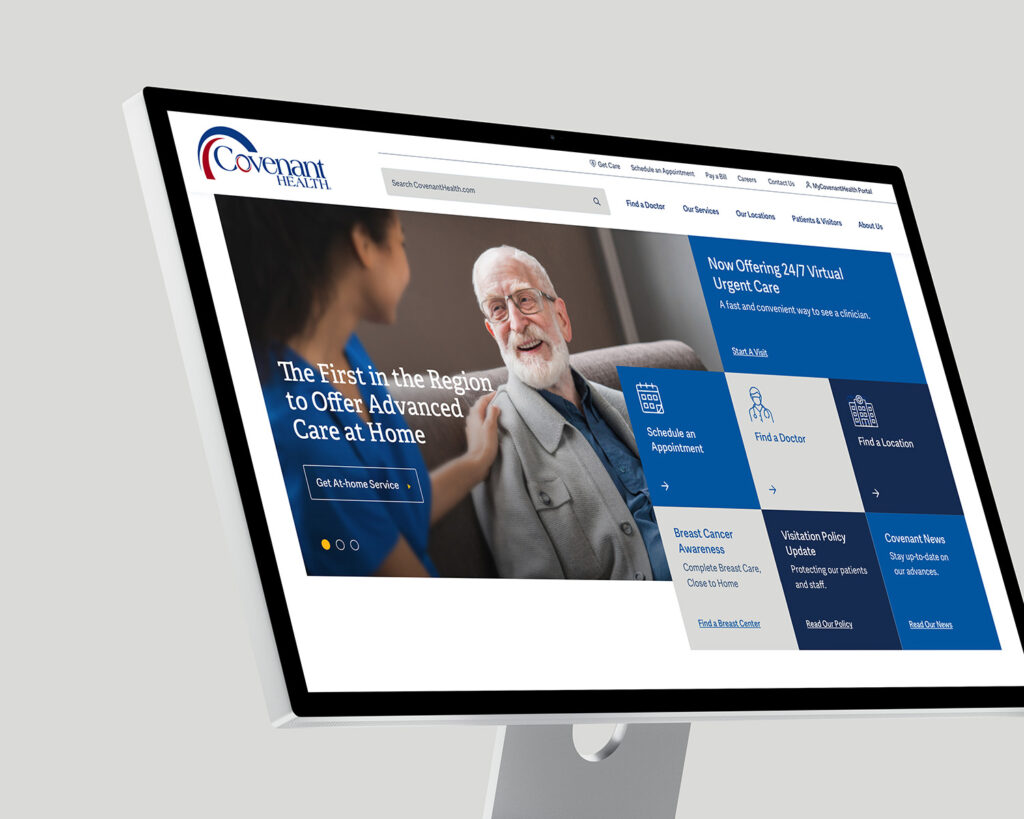
Covenant Health was overwhelmed with maintaining over 80 different websites. Designsensory transformed their online presence and simplified their content management by streamlining all those sites into one powerful, cohesive multisite platform.

Covenant Health Client Story >

2. It Doesn’t Meet ADA Standards

Digital accessibility is not just a matter of good practice; it’s increasingly a legal requirement. An inaccessible website can exclude users with disabilities, potentially leading to lost business and even lawsuits.

If your site is not designed to meet Web Content Accessibility Guidelines (WCAG) standards, it is inherently difficult for visitors to use who rely on screen readers, keyboard navigation, or other assistive technologies. A new website build is the perfect opportunity to prioritize inclusivity and compliance. Designsensory builds all websites to meet WCAG 2 AA and follows best practices for ADA, so your website will be inclusive for all.

ADA Updates Example: Bush’s Beans

Three phones showing the Bush's Beans website and custom landing pages.

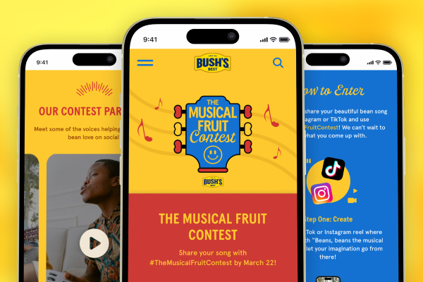
When Designsensory took over management of the iconic Bush’s Beans website, it was failing to meet modern accessibility standards. We redesigned pages and content blocks to meet color contrast requirements while maintaining their bold, bright brand colors.

Bush’s Beans Client Story >

3. It’s Not Optimized for Mobile Screens or Speed

If your website isn’t fast, people will leave. If it doesn’t look great on a smartphone, people will leave.

Slow loading times and a non-responsive design are two of the quickest ways to frustrate visitors and drive them to your competitors. Google also heavily prioritizes speed and mobile-friendliness in its search rankings. A new website from Designsensory is built using modern techniques that ensure lightning-fast performance and flawless display across all devices, as well as navigation menus that make sense no matter what devices your audience is using.

Website Mobile & Speed Optimization Example: Zoo Knoxville

Two mobile phones showing the Zoo Knoxville website.

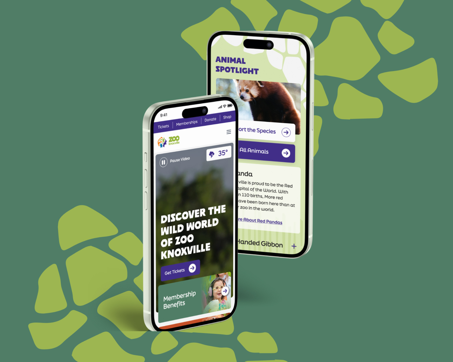
Zoo Knoxville’s website was outdated and slow. Designsensory started from a user-first perspective and created a digital experience that aligned the Zoo’s mission messaging with a visitor-first design.

Zoo Knoxville Client Story >

4. It Has Outdated Branding or Design Trends

Look at your website. Does it reflect your current brand identity? Do the fonts, colors, and overall design feel contemporary?

Web design trends evolve constantly. If your site looks like it was built in a previous decade, it can make your entire business seem behind the times. A brand design refresh can instantly communicate professionalism and modernity, aligning your digital presence with your business’s current success and future goals. The expert digital designers at Designsensory can create a website that’s current and trendy, or something more classic—whatever aligns with your brand goals. Your new design will look great and can include detailed motion graphics and seamless user interaction to enhance your content.

Branding Updates Example: Arrowmont

Crafted "A" branding mark for Arrowmont.

Arrowmont School of Arts and Crafts showcased incredible art and artists, but struggled to translate that into a cohesive, creative brand. Designsensory moved forward with a full digital refresh AND rebrand, refining Arrowmont’s core visual identity and designing for the future.

Arrowmont Client Story >

5. It’s Not Following Updated SEO (And GEO!) Practices

If you’re creating great content but seeing little traffic, the problem may be your website’s foundation. A site with poor Search Engine Optimization (SEO) is fundamentally difficult for search engines like Google to crawl and understand.

Outdated or poorly coded websites often lack essential SEO features such as schema markup, proper site structure, or fast page load times. Rebuilding your site with SEO best practices baked into the core structure is crucial for long-term organic traffic growth.

While SEO is still important, it’s no longer enough to follow SEO best practices and call it a day. As more and more users turn to AI models for search, websites now need to incorporate GEO (Generative Engine Optimization) strategies to make certain their content gets attention. Designsensory can help your company build SEO and GEO strategies into your website from the ground up, ensuring that both traditional search engines and AI models can easily discover and promote your brand.

SEO + GEO Best Practices Example: See Rock City

Several screens showing the See Rock City website.

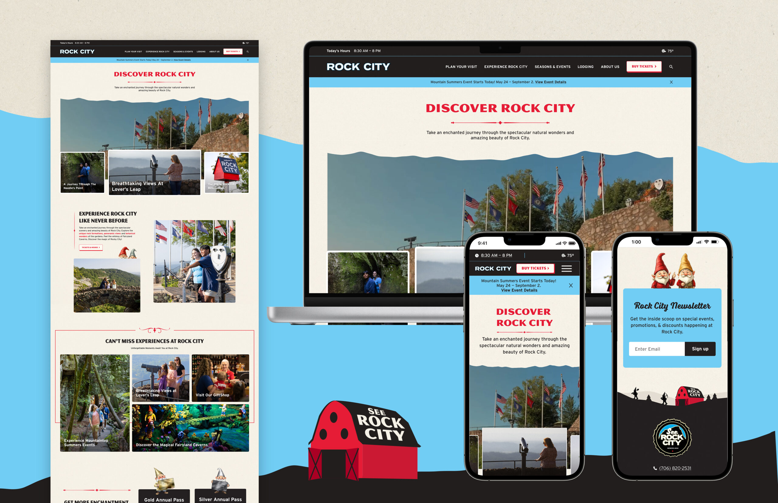
Rock City’s outdated website was struggling to perform in both traditional search and AI search. Designsensory developed a new website that followed SEO, GEO, and UX best practices from the ground up, integrating an intuitive user flow for ticketing and designing a digital visual identity to communicate the enchanting experience. Finally, we created a content and SEO strategy to implement on the new website to ensure that users from all over discover Rock City and all it has to offer.

A Bonus Sign: It’s Built on Old Technology

Older websites often rely on obsolete code and platforms. This creates a cascade of problems:

  • Poor User Experience (UX): Old technology limits the interactive features and smooth navigation that modern users expect. The loading speed, navigation, and design issues compound to make the website unusable, let alone ADA accessible.
  • Security Issues: Unmaintained or legacy platforms are a prime target for hackers, leaving your data and your visitors’ data vulnerable. If your website no longer supports security updates, plugin upgrades, or content refreshes, your site is not only looking stale but is also a significant security and privacy risk.

My Website Needs Updating. Now What?

If any of these signs sound familiar, it’s time to start planning your new, optimized, and secure digital home. Reach out to Designsensory today to schedule a consultation for your website redesign. Our web development process starts with experts listening to you to identify your pain points, with dedicated account and project managers prepared to keep things on timeline and under budget. Are you ready? Let’s design a website to carry your brand into the future.

The Brand Equation: How Customer Feelings Create Financial Value.

Posted on by Ilana Stark

Let’s be clear: when we talk about “brand,” we’re just talking about a logo or a tagline. Well, we are. But that thinking is small and dated. Branding started with farmers branding cattle to prove ownership, but in a market this crowded, a brand is what separates you from the noise. It’s the difference between a generic product and something people actually want. It’s the feeling of unboxing an Apple product or the baseline trust in Tylenol.

The goal is to build value that goes way beyond the physical product.

The Kinds of Brand Value

People don’t just buy what a product does; they buy what it means. A strong brand delivers on multiple fronts:

  • Functional Value: Does the thing work? This is table stakes. A generic pain reliever and Tylenol both fix a headache. You don’t win on this alone.
  • Emotional Value: How does the brand make people feel? Jeep feels rugged and free. Mercedes feels like you’ve made it. These feelings drive decisions.
  • Experiential Value: This is every single touchpoint. The UI on your banking app, the in-store vibe, the way the product is packaged. It all adds up to a memorable (or forgettable) experience.
  • Identity Value: What you buy signals who you are. Buying Allbirds says you care about sustainability. A luxury watch signals success. Brands become part of a person’s story.
  • Social Value: Brands can build communities, or “tribes.” Think about sports fans, online gaming forums, or a running club sponsored by a sneaker brand. It creates a sense of belonging.
  • Relational Value: This is about trust. Does the brand act like a reliable partner? Think of your bank or a tool brand that’s never failed you.

Identity vs. Image: Your Plan vs. Reality

To manage a brand, you have to know the difference between what you’re pushing out and what the customer is actually picking up.

  • Brand Identity is your strategic plan. It’s the name, logo, stories, and values you intend to project. It’s the lens through which you want the world to see your product.
  • Brand Image is the reality. It’s how consumers actually see the brand, based on their experiences, word-of-mouth, and whatever they see on social.

Our job is to close the gap between the two.

So, How Do You Measure This? (The Two Sides of Equity)

If a brand’s power is in the consumer’s head, how do we measure it? Brand equity is a two-sided coin: one side is what the customer thinks (CBBE), and the other is what the accountants can measure (FBBE).

1. Consumer-Based Brand Equity (CBBE)

This is the side we’ve been talking about—the total sum of what a person thinks and feels about a brand. It breaks down into two main parts:

  • Brand Awareness: This isn’t just familiarity. It’s two things:
    • Recall: Thinking “Coke” when someone says “soda.”
    • Recognition: Seeing the red can and knowing it’s Coke.
    • Top-of-mind awareness is the whole point—being the first brand that comes to mind when it’s time to buy.
  • Brand Knowledge: This is the network of associations people have with your brand—the thoughts, feelings, and beliefs. For brand equity to be strong, these associations need to be:
    • Powerful: Easy to remember.
    • Positive: People actually like them.
    • Distinct: They set you apart from the competition.

Get CBBE right, and you get loyal customers who are less sensitive to price, more willing to try your new products, and more forgiving when you screw up. They become advocates who do your marketing for you. They don’t just buy the brand; they buy into it.

2. Firm-Based Brand Equity (FBBE)

This is the other side of the coin, where all that customer goodwill gets translated into dollars and cents. Firm-Based Brand Equity (FBBE) measures the brand’s value as a separable, financial asset to the firm. If CBBE lives in the customer’s mind, FBBE lives on the balance sheet.

It answers the question: “What is the brand actually worth to the business in financial terms?”

FBBE is the direct result of strong CBBE. Because customers recognize, recall, and feel positively about your brand (CBBE), they act in ways that create measurable financial outcomes for the firm. This includes:

  • Price Premium: The ability to charge more for your product than a generic equivalent.
  • Increased Cash Flow: More people buying your product more often.
  • Lower Customer Acquisition Costs: Your brand’s reputation does the selling for you.
  • Higher Market Share: Winning against competitors.
  • Increased Asset Value: The brand itself can be sold or licensed, adding billions to a company’s valuation.

Think of it as a bridge. CBBE is the foundation on one side of the river (the customer), and true business success is on the other. FBBE is the bridge that connects them. Throughout this series, we’ll explore how to build that bridge, from crafting stories to managing your brand for long-term financial growth.

Next up, we’ll get into brand storytelling—crafting the narratives that build these powerful connections.

Our Entries for the 61st Annual American Advertising Awards

Posted on by Hunter Foster

We’re so excited to share that our team has officially submitted several standout projects to the American Advertising Federation (AAF) Knoxville Awards.

Being based in Knoxville, Tennessee, we take so much pride in the work we produce for both local and national partners. This year’s submissions span a wide range of disciplines—from immersive branding and AI-driven social content to high-profile web experiences.

Here’s a look at our 2025-2026 Addy entries:

Zoo Knoxville – “Aviary: A World of Wonder” Campaign

  • Best of Show + Gold

For the launch of Max’s Aviary, we built a campaign celebrating macaws as nature’s most vibrant storytellers. Vivid, National Geographic–style portraits and evocative headlines invited guests to see these birds as dazzling, intelligent, and worthy of awe.

  • Credits: Ben Maxey, Chris Cable, Ilana Stark, Kate Ambos

Designsensory – Brand & Website

  • Gold

Our own flagship digital experience! Rebuilt from the ground up, the new DS website embodies our evolved identity: bold, intelligent creativity rooted in strategy. It functions as both a brand flagship and a high-performance business development tool.

  • Credits: Ben Maxey, Joseph Nother, Erik Vass, Ryan Lee

Raptor Coffee Social Media AI Content

  • Judge’s Choice + Silver

To match the bold character of Raptor Coffee, we brought their mascot, Wyatt the Raptor, to life using 3D modeling and cutting-edge AI technology. This project let us create high-volume, high-quality animated content that’s as layered as the coffee blend itself.

  • Credits: Ben Maxey, Hunter Foster, Ilana Stark, Joseph Nother, Chelsea Penticuff, Abby Webb

Bush’s Beans – Bluey Web Campaign

  • Silver

Collaborating with the global phenomenon Bluey, we developed a digital hub for Bush’s Beans that felt like an extension of the Heeler family home. Featuring interactive “sticker” animations and thematic recipes, the site successfully bridged the gap between fan engagement and in-store purchase.

  • Credits: Ryan Lee, Courtney Borgers, Colby Johnson, Kate Ambos

South Dakota Governor’s Office of Economic Development – “Open for Opportunity” Campaign

  • Silver

Tasked with attracting business and talent to the state, we developed the “Open for Opportunity” campaign. By featuring real people from successful companies instead of stock imagery, we built an authentic and persuasive narrative for the state.

  • Credits: Ben Maxey, Joseph Nother, Erik Vass, Ryan Lee, Chelsea Penticuff, Abby Webb

Our Other 2026 Entries:

South Dakota Governor’s Office of Economic Development – Branding

We executed a comprehensive brand architecture overhaul for the South Dakota Governor’s Office of Economic Development. The new system includes a modern brand mark inspired by Sioux tribal motifs, symbolizing precision and momentum.

  • Credits: Ben Maxey, Joseph Nother, Erik Vass, Ryan Lee, Chelsea Penticuff, Abby Webb

Arrowmont School of Arts and Crafts – Branding

Honoring 80 years of legacy, we reimagined the brand for Arrowmont School of Arts and Crafts. The new visual identity features the “Arrowmont Alpha”—a symbol designed for artist reinterpretation—and a modular design philosophy that echoes the creative process.

  • Credits: Erik Vass, Joseph Nother, Ben Maxey, Chris Wise, Ryan Lee, Barry Hylton, Chris Talbert, Courtney Borgers, Mary Blair, Jenna Newton

Good Gravity Entertainment – Branding, Video, Web

To launch our new unscripted entertainment division, we developed a modular, lunar-inspired “G” mark. The identity system is future-proof, anchoring everything from broadcast lower-thirds to responsive web layouts.

  • Credits: Ben Maxey, Joseph Nother, Erik Vass, Ryan Lee

LLM Ads Are Coming, Will They Redesign the Customer Journey?

Posted on by Ilana Stark

Advertising works best when context meets intent. For years, the digital marketing industry has operated on the understanding that Large Language Models (LLMs) like ChatGPT are, at their core, high-intent environments. When a user arrives at a chatbot, they usually have a specific need, they are asking for help, and they are already mid-to-low funnel.

It is no surprise that OpenAI is beginning with embedded partners offering simple, low-friction conversions. However, the true disruption lies not in where the ads are placed, but in how they function.

Here is how LLMs are poised to shift the paradigm from display to dialogue.

Compressing the Marketing Journey

The most significant difference between a standard search ad and an LLM recommendation is the compression of the funnel.

In traditional digital marketing, discovery, consideration, and conversion are often fragmented steps across different sites and sessions. LLMs have the potential to collapse this entire journey into a single conversational arc. Because the interface mimics human dialogue, ChatGPT (and Gemini and Claude) doesn’t just wait for explicit intent signals—it can surface brand, product, or service options as contextually relevant answers that emerge naturally.

Why this changes the game:

  • Organic Embedding: Instead of a banner fighting for attention, the product becomes a citable solution within the answer.
  • Predictive Suggestion: By inferring patterns from similar user interactions, the AI can make predictions that feel far more tailored than a static display ad ever could.

In short: The ad unit is the conversation, and the recommendation is embedded organically within it.

The Architecture of Trust (or, The Data Analogy)

If the format is different, is it more convincing? Given the intimate data LLMs hold, the answer is likely yes—but not for the reasons you might think. It isn’t about intrusive targeting; it is about the role of the assistant.

To understand the future of AI influence, we can look to a classic science-fiction analogy: Spock vs. Commander Data.

  • Spock (Star Trek: TOS) represents the trusted friend. His logic helps shape decisions, representing classic word-of-mouth influence.
  • Data (Star Trek: TNG) is the evolution of that role. He is a machine, but a trusted one. He offers precise options, alternatives, and solutions that routinely influence the crew’s choices.

AI will occupy a cultural space similar to Commander Data. The operative word is trust. If users believe the information is verifiable and not manipulative, AI-embedded recommendations can reshape how people discover products. The influence won’t come from ad placement, but from the credibility of the assistant delivering it.

The Ambient Future

This trust becomes even more critical as the interface evolves. OpenAI is exploring voice-only and screenless devices (potentially in collaboration with Jony Ive). If the vision of a “Star Trek-style communicator” comes to fruition in 2026–27, AI becomes a constant, ambient presence.

In a voice-first world, there is no room for a sidebar ad. There is only one answer. This collapses discovery, recommendation, and transaction into a single, agentic moment.

The Bottom Line

LLMs have the potential not just to interrupt the customer journey, but to redesign it.

We are moving toward a future where ads are not perceived as ads, but as helpful solutions delivered by a trusted agent. For marketers, the challenge will be shifting from buying attention to earning relevance within the conversation.

Ready to future-proof your marketing strategy?

The landscape of search and discovery is changing faster than ever. Subscribe to our newsletter today to get the latest insights on AI, marketing ethics, and the new economy delivered straight to your inbox.

Our 2025 Year in Review

Posted on by Hunter Foster

As we wrap up 2025, we can’t help but feel incredibly grateful. This wasn’t just a year of growth, it was about strengthening our foundation and getting crystal clear on where we’re headed. With our 25th anniversary coming up in 2026, we’re looking back at a year packed with major awards, strategic acquisitions, and partnerships that truly moved the needle.

Here’s what made 2025 one for the books.

Growing Our Team and Our Capabilities

This year, we made some big moves to level up both our work and our culture.

We brought on some serious talent – Stuart Hohl, Brian Fuson, and Lauren Schuster  – to join our Client Services, Creative, and Business Development teams, and they’re already bringing fresh energy and perspective to everything we do.

We also unveiled our agency rebrand, finally aligning our look with the forward-thinking work we’ve been creating all along.

But the biggest game-changer? Acquiring our sister production company, PopFizz. Bringing their incredible production capabilities in-house means we can move faster and push creative boundaries like never before.

Winning on the National Stage

Our work kept getting recognized in some pretty big places this year.

We took home a National Gold ADDY for our Wicked activation in Regal Times Square—a project that was equal parts crowdpleasing spectacle and behind-the-scenes execution.

And we won a People’s Voice Webby Award for Food Network Obsessed, which shows we’re leading the way in the ever-changing digital and audio world.

Building Partnerships That Matter

From our Tennessee backyard to regional powerhouses, our 2025 partnerships have been all over the map (in the best way):

In sports and entertainment, we deepened our relationship with The Volunteer Club by helping the NIL collective shift into its next era and partnering with them for the launch of a new University of Tennessee athlete interview broadcast series, Beyond the Orange.

We’re supporting The Memphis Chamber (the 2025 ACCE Chamber of the Year) on their innovative Digital Delta initiative, which is economic development work we’re really proud of.

On the tourism front, we’re deepening our roots in Gatlinburg by working with The Greystone Lodge. And, we partnered with the Tennessee Department of Tourist Development to launch a social media training program for counties across the state—something we’re excited to keep building next year.

Our media and experiential team has been busy with Discovery Park of America and Covenant Health, handling everything from influencer partnerships to traditional media buying. While our interactive and creative teams are continuing to grow our longtime relationships with Rock City and Bush’s Beans.

We also kicked off exciting new work with the Bowling Green Area CVB, helping tell their story in fresh ways through research and branding. And we’ve got a surprise up our sleeve—a whisky account we’re not quite ready to announce yet, but trust us, it’s worth the wait.

Where We’re Headed Next

As we head into 2026, a year in which Designsensory will turn 25, we know exactly where we’re focused. We’re leaning into AI to help us do more, faster. By automating the repetitive stuff, we’re freeing up our greatest asset: our people. The goal for 2026? Let technology handle the data and the grunt work, so our team can focus on what humans do best—the strategy, the empathy, and those wild what-if ideas that only people can dream up.

Beyond workflows, we’re also expanding our services to stay ahead of AI’s impact on digital marketing—things like GEO (Generative Engine Optimization)—while doubling down on what we’ve always done well: building interactive tools and systems now powered by AI.

Thanks for an Incredible Year

To our clients, our team, and our community, thank you! We’ve spent 24 years building something special, and heading into year 25, the momentum has never felt stronger.

Let’s keep breaking the mold in 2026. 

The New Playbook of Sports Fandom: 2025 Strategic Report

Posted on by Ilana Stark

The monolithic fan is dead. The sports landscape is fundamentally split into Legacy and Growth Ecosystems, demanding completely different media strategies. This report provides the definitive 2025 blueprint for monetizing modern fandom, detailing the shift to player-first loyalty, the necessity of “shoulder programming,” and the financial opportunity presented by high-growth properties like the WNBA (avid fandom up 65%).

Stop targeting the average fan. Download the report to master the integrated strategy that drives action in 2025.

Funky Fonts & Forward-Thinking Brands: How Playful Typography Sets You Apart

Posted on by Ilana Stark

Close your eyes and picture this: An old-timey paperboy stands at the corner of a bustling city street, shouting, “Read all about it!” He’s holding up a newspaper with a massive, eye-catching headline, and no one can resist a quick glance. In that single moment, the typography does all the heavy lifting—it shouts, “Look at me!” and wins your attention before you ever read a word of body copy.

Fast-forward to today’s digital world. We’re bombarded by brand messages in every feed, on every platform, and across countless devices. The question becomes: How do you stand out? Sometimes, the best way to get noticed is to be a little weird, a little funky, and a lot memorable. That’s where unexpected, playful typefaces come in.

The Case for Quirky Type: Why Weird Sometimes Wins

There’s a time and place for classic typefaces. Fonts like Helvetica, Garamond, or Times New Roman have stood the test of time because of their versatility and timelessness. But as more and more brands look to express a unique personality, safe choices can sometimes be too safe.

Think of it like fashion. A well-tailored black suit will always look sharp, but if you’re trying to turn heads at a big event, maybe it’s time for a vibrant blazer or bold accessories. In branding, your “accessory” might be a surprising typeface—one that breaks the mold of “corporate minimalism” and stops people mid-scroll.

Playful, funky, and even slightly awkward fonts can do a lot of heavy lifting for your brand:

  1. Memorability: People’s minds latch onto novelty. If your font feels fresh or a little offbeat, it sticks.
  2. Emotional Resonance: Typography can evoke mood just like color or music—whimsical curves and playful flourishes can spark joy, curiosity, or excitement.
  3. Brand Differentiation: With countless brands vying for attention, a weird font can be the quickest way to stand out in a sea of sans-serifs.

Of course, it’s not enough to pick a wild typeface and call it a day. You want your typography to support a bigger message about who you are as a brand and what you offer.

UnderConsideration’s Brand New: Where Funky Trends Take Center Stage

If you’re looking for a pulse on what’s shaking up the branding world—especially in terms of interesting and out-there type—UnderConsideration’s Brand New is where you should point your browser. Think of it as a living, breathing newsfeed of brand transformations and identity overhauls.

The folks at Brand New review major (and sometimes minor) rebrands, commenting on everything from color palettes and logos to, yes, typography. Over the years, it’s become a sort of community hub where designers, marketing pros, and brand enthusiasts chime in with critiques or praise for new brand work. And what’s especially cool is seeing how many brands are leaning into unusual, customized typefaces to breathe fresh life into their identities.

By scanning through Brand New’s archives, you’ll notice the rise of expressive lettering and funky design that, a decade ago, might have been dismissed as “too eccentric.” Now, it’s widely embraced if done thoughtfully. The takeaway? If you’re flirting with the idea of unconventional type for your own brand, you’re not alone—and you might just be on-trend.

Gush by Pentagram: When Typography Reflects (Liquid) Personality

Let’s take a look at a rebrand that captures this fun, boundary-pushing spirit: Gush, developed by the design powerhouse Pentagram. While the brand itself might not be a household name like Coca-Cola or Apple, it’s a fantastic example of how type can be the real star of a visual identity.

What’s Gush All About?

Gush is a creative platform focused on capturing movement, fluidity, and bold expression. Their identity employs a custom typeface that mirrors the shape and flow of water droplets. The letters feel organic, almost alive, with playful proportions and big, round counters. It’s definitely not your standard minimalistic Gotham or Helvetica clone—and that’s exactly the point.

Why This Works

  1. Brand Messaging: The idea of “gushing” conjures images of waves, liquid, and free-flowing creativity. The typography personifies that concept with letterforms that appear to be in motion.
  2. Memorable First Impression: We’re so used to tight, geometric type that seeing these fluid shapes gives your brain a little jolt. If you see a Gush piece of marketing, you’ll remember it.
  3. Flexibility Across Media: The identity doesn’t just look cool on a website. The watery typeface can be animated, printed, embedded—whatever the brand needs.

Gush teaches us that when your brand story aligns perfectly with a distinctive type style, magic happens. It becomes more than just letters on a page; it’s an experience.

SanDisk’s Refresh: Balancing Corporate & Cool

On the other end of the spectrum is the new SanDisk identity, which made headlines in branding circles for giving a techy, established company a modern facelift. If you’ve ever used a SanDisk memory card, you’re probably used to their simple, recognizable logotype. But as technology evolves, so does the need to stand out in an incredibly saturated market—especially when competing with other memory and storage giants.

The Key Typography Choice

The newly unveiled SanDisk identity leans into unconventional letterforms to express innovation, speed, and a forward-thinking ethos. While still professional enough to suit enterprise clients, you’ll notice some quirky details that break from the old, rigid style. Angles might be sharper, curves might be a bit more pronounced, and certain letters are styled in a way that suggests motion or cutting-edge design.

Why This Matters

  • Differentiation: SanDisk competes with companies like Samsung and Lexar; a more memorable typeface sets them apart on packaging and advertising.
  • Subtle Funkiness: The typeface isn’t outrageous—it’s not full of wild swashes or bizarre ligatures—but it pushes just enough boundary to convey a fresh, updated vibe.
  • Scalability: SanDisk’s brand system is used on everything from microscopic product labels to large trade show banners. A well-designed, distinctive type needs to scale while remaining recognizable.

The result is a perfect compromise between corporate utility and creative flair. It’s a blueprint for how established companies can adopt a bit of funk without alienating their core audience.

Conveying Tone Through Type

So what exactly makes a funky typeface convey a particular tone, and how can you leverage that for your own brand? The secret lies in understanding how each design decision in a typeface can create a visual voice.

  1. Serifs, Sans-Serifs, and Beyond: Serifs can evoke tradition and trustworthiness, while sans-serifs often feel modern and clean. For a funky vibe, consider serif typefaces with exaggerated feet or sans-serifs with playful curves and unusual proportions.
  2. Weight & Contrast: Heavier fonts can feel bolder and more confident. High-contrast letterforms (thin meets thick) can appear elegant or even flamboyant. Think about how these qualities align with your brand message.
  3. Spacing & Alignment: Kerning, tracking, and leading (line spacing) can significantly change how “open” or “tight” your design feels. If you want a breezy, airy vibe, give your letters room to breathe. If you want urgency, tighten it up for impact.
  4. Case Usage & Letter Shapes: All-caps can come across as strong or even shouty. Lowercase can read as friendly or approachable. Mixing it up (small caps, or a single capital letter in an otherwise lowercase word) can add quirkiness without going overboard.

When used wisely, these elements form the backbone of a brand’s typographic identity. They ensure that even a single word set in your brand’s typeface instantly conveys the right mood.

Funky Fonts as the Foundation for a Greater System

One common misconception is that a “funky” typeface can only be used in flashy headlines or one-off marketing stunts. But the truth is, unusual typefaces can absolutely form the backbone of an entire brand system, as long as you build your guidelines with care.

  • Hierarchy: Maybe you have one super-expressive display type for headlines, and a more neutral but complementary font for body text.
  • Color Palettes: Bold type often pairs well with vibrant color. Just make sure to test readability.
  • Graphics & Icons: If your letters have a certain weird shape, you can riff on that for secondary graphic elements, shapes, or iconography.
  • Motion & Animation: A typeface with funky curves can be easily animated for social posts or digital billboards, creating an engaging, cohesive brand moment.

When it all comes together, you’re not just slapping a weird font on your ad and hoping for the best. You’re crafting a system that tells a story from top to bottom, whether on a business card, a web banner, or a physical storefront.

Pitfalls & How to Avoid Them

Of course, the danger with pushing the boundaries is, well, pushing them too far. Sometimes a strange typeface might clash with your brand’s actual personality or overshadow important messaging. Here are a few ways to keep things in check:

  1. Test, Test, Test: Before rolling out a funky font across all your materials, see how it looks in different contexts (digital, print, big, small, etc.).
  2. Feedback: Gather opinions from your team or even a small user group. Do they find the type intriguing, confusing, or off-putting?
  3. Accessibility: Quirky letterforms can sometimes challenge readability, especially for users with visual impairments. Consider employing accessibility best practices like adequate color contrast and legible letter spacing.
  4. Brand Alignment: If your product is all about serious data security, maybe a kooky font with dripping letterforms isn’t the best fit. Strike a balance that respects your core values.

Just because a font looks awesome in a vacuum doesn’t mean it’s right for your brand. The real trick is finding a type style that’s as unique as you are—and still conveys the right messaging.

Bringing It All Together

So, are we saying every brand should ditch their traditional typeface and leap headfirst into a carnival of swirling letterforms? Not necessarily. The real message is that considered, distinctive typography can be a powerful secret weapon—especially if you’re fighting for attention in competitive markets.

  • Relevance: Make sure your funky font aligns with your brand DNA.
  • Purpose: Use the typeface to reinforce your message, not to hide it.
  • Strategy: Incorporate it into a wider system of design elements for maximum impact and consistency.

Final Thoughts: Dare to Be Different

When done right, a weird and wonderful typeface can become your brand’s own version of that city-corner paperboy, shouting your headlines loud and proud. And in a world brimming with white noise, having a typeface that says, “Hey, look over here!” might be just what your brand needs.

The ROI of Investing in the Right Team (Not Just Tools)

Posted on by Ilana Stark

In today’s world of automation, dashboards, and “smart” software, it’s tempting to think tech alone drives marketing success. But tools don’t run campaigns, people do.

Strategy Doesn’t Come Out of a Box

Automation can handle tasks, but without the right team steering, it’s just guesswork at scale. Real ROI comes from human insight.

We’ve seen it: campaigns left on autopilot, budgets drifting into underperforming segments, dashboards full of numbers but no real answers.

A campaign targeting a broad demographic with a generic message might run for months with low engagement and wasted spend, simply because no one was actively managing it.

A strong team changes that. They monitor performance daily, tracking metrics like engagement, click-through-rate, conversion rates, and creative performance, not just letting the campaign run. When they see a drop in performance, they act: tweaking messaging, testing new creative, pausing underperformers, and reallocating budget where it matters.

That kind of hands-on optimization is what keeps campaigns effective and efficient.

Strategy demands curiosity, real-time adjustments, and the ability to turn data into decisions, skills that come from experience, not software.

Human Judgment = Real Results

What sets us apart is the level of human attention each campaign gets. We don’t “set and forget.” We’re in accounts daily: adjusting spend, checking pacing throughout the lifetime of the campaign, shifting audiences to better reach a target, and pausing underperformers. 

That hands-on approach lets us catch what algorithms miss: audience shifts, creative fatigue, and performance anomalies. These aren’t just tasks, they’re insights only engaged humans can surface and act on.

Tools Support. People Lead.

We love automation, it helps us work faster and smarter. But tools are just that: tools. They provide data. People decide what matters, and people make a difference.

Real success comes from blending intuition with analytics, and strategy with adaptability, something no tool can fully replicate.

The Right Team Brings What AI Can’t

Even Google says it: top marketers succeed not because they use AI, but because they bring human qualities that AI simply can’t replace:

  • Curiosity: AI can surface trends, but it takes human curiosity to ask why. The best marketers don’t stop at dashboards, they dig into patterns, outliers, and behavior shifts to uncover insights that drive smarter decisions. They ask the right questions and pursue the nuances no algorithm is trained to see.
  • Creativity: AI can help generate content, but it can’t craft stories that feel. Emotion, humor, timing, cultural relevance. These are human instincts. Great marketers use creativity to connect with audiences on a deeper level, transforming strategy into campaigns that make people care and act.
  • Empathy: Metrics tell you what people did, not why they did it. Human empathy brings the context: understanding fears, motivations, and needs. It’s the difference between talking at people and truly communicating with them. Great marketers use empathy to build trust and relevance.
  • Agility: AI needs time to learn and recalibrate. People can pivot on the spot. Whether it’s responding to market shifts, client needs/requests, changing campaign goals, or a sudden creative insight, human teams can make the quick, strategic moves that keep campaigns effective, even under pressure.
  • Collaboration: AI doesn’t work cross-functionally. But marketers do. The best outcomes happen when media strategists, creatives, data analysts, and clients come together to align messaging with goals. Collaboration brings out the best in every channel, and every person involved.

These are the skills that drive impact, unlock efficiency, and ensure your media spend delivers real value. When You Invest in the Right Team, You Get:

  • Faster pivots when plans change
  • Smarter spend optimization, not just rule-based logic
  • Strategic eyes on creative, messaging, and targeting
  • Transparent conversations about what’s working (and what’s not)
  • Fresh perspectives that challenge assumptions and spark innovation
  • Strategic decisions grounded in experience, not just metrics

This is the real return on investing in people, not just platforms.

Where Traditional Media Fits in a Digital World

Posted on by Ilana Stark

In a media landscape shaped by clicks, scrolls, and short attention spans, it’s easy to assume traditional channels are past their prime. But that assumption misses the bigger picture – and the bigger opportunity.

TV, radio, print, and out-of-home aren’t dead. They just need to be used more intentionally. When done right, they add reach, trust, and staying power to digital strategies that move fast but sometimes struggle to stick.

Here’s how we’re using traditional media to help clients grow, and how it could be working harder for your brand, too.

1. Traditional Still Reaches – Big Time.
If you need broad awareness or want to win a local market, traditional media still delivers.

TV brings scale and visibility, especially around live events or regional campaigns. Radio reaches people during their routines like driving, working, or running errands, and builds frequency through repetition. Billboards and OOH cut through digital noise and get seen by people not already in your funnel.

For our clients, we often lean into traditional when we need visibility fast or when we want a brand to show up boldly in the real world, not just online. It’s not about nostalgia. It’s about attention. And traditional media still gets a lot of it.

2. It Builds Trust You Can’t Always Buy Online.
Digital is great for targeted reach, speed, and flexibility. But it can also have its baggage, like low-quality content, privacy concerns, and oversaturation.

Traditional media, especially in credible or familiar environments, carries built-in legitimacy. A well-placed magazine ad or radio spot often feels more vetted, more stable, and can elevate your digital brand. For clients looking to build long-term credibility or show up as a meaningful brand in people’s minds, this type of placement matters. 

3. It Doesn’t Compete With Digital – It Makes It Stronger.
Some of the best results we deliver come from integrated campaigns where traditional and digital play off each other instead of working in silos. It’s something we actively plan for, not just hope happens.

  • A billboard can create name recognition before someone even hits search.
  • A radio ad can prime awareness that turns into a click later that day.
  • A TV spot can drive real-time engagement on social during a campaign launch.

If your digital campaigns aren’t getting the traction you hoped for, the issue might not be the creative or the platform. It might be what’s missing around them.

4. It All Comes Down to Fit.
There’s no one-size-fits-all media mix. The right plan depends on what you’re trying to do and the audience you’re trying to reach.

Launching a new brand? Traditional helps you scale awareness fast.
Targeting an older or hyper-local audience? Radio and print still win.
Focused on conversions? Digital should do the final lift, but traditional can help lay the groundwork for trust and familiarity.

When we work with clients to define the right mix, it’s always grounded in context, not guesswork. Traditional doesn’t mean outdated or unsophisticated. It just requires strategy that goes beyond reach and frequency.

So, Where Does Traditional Fit Today?

When we build media strategies for our clients, we don’t rank channels – we evaluate roles. Traditional sits right alongside digital, not behind it. Because when it’s used with intention, it still earns attention, builds trust, and drives action, especially in places digital can’t always go.

This isn’t about clinging to the past. It’s about being smart enough to use every tool that works, and bold enough to design a strategy that actually delivers.

If your current mix isn’t hitting the mark, it might be time to reconsider what traditional media could do for you when it’s done with purpose.