
Funky Fonts & Forward-Thinking Brands: How Playful Typography Sets You Apart

Spread the word. ❤️🔥
C’mon. I know you want to subscribe to our Email List.
Or Follow us on X and Facebook.
Funky Fonts & Forward-Thinking Brands: How Playful Typography Sets You Apart
Close your eyes and picture this: An old-timey paperboy stands at the corner of a bustling city street, shouting, “Read all about it!” He’s holding up a newspaper with a massive, eye-catching headline, and no one can resist a quick glance. In that single moment, the typography does all the heavy lifting—it shouts, “Look at me!” and wins your attention before you ever read a word of body copy.
Fast-forward to today’s digital world. We’re bombarded by brand messages in every feed, on every platform, and across countless devices. The question becomes: How do you stand out? Sometimes, the best way to get noticed is to be a little weird, a little funky, and a lot memorable. That’s where unexpected, playful typefaces come in.
The Case for Quirky Type: Why Weird Sometimes Wins
There’s a time and place for classic typefaces. Fonts like Helvetica, Garamond, or Times New Roman have stood the test of time because of their versatility and timelessness. But as more and more brands look to express a unique personality, safe choices can sometimes be too safe.
Think of it like fashion. A well-tailored black suit will always look sharp, but if you’re trying to turn heads at a big event, maybe it’s time for a vibrant blazer or bold accessories. In branding, your “accessory” might be a surprising typeface—one that breaks the mold of “corporate minimalism” and stops people mid-scroll.
Playful, funky, and even slightly awkward fonts can do a lot of heavy lifting for your brand:
- Memorability: People’s minds latch onto novelty. If your font feels fresh or a little offbeat, it sticks.
- Emotional Resonance: Typography can evoke mood just like color or music—whimsical curves and playful flourishes can spark joy, curiosity, or excitement.
- Brand Differentiation: With countless brands vying for attention, a weird font can be the quickest way to stand out in a sea of sans-serifs.
Of course, it’s not enough to pick a wild typeface and call it a day. You want your typography to support a bigger message about who you are as a brand and what you offer.
UnderConsideration’s Brand New: Where Funky Trends Take Center Stage
If you’re looking for a pulse on what’s shaking up the branding world—especially in terms of interesting and out-there type—UnderConsideration’s Brand New is where you should point your browser. Think of it as a living, breathing newsfeed of brand transformations and identity overhauls.
The folks at Brand New review major (and sometimes minor) rebrands, commenting on everything from color palettes and logos to, yes, typography. Over the years, it’s become a sort of community hub where designers, marketing pros, and brand enthusiasts chime in with critiques or praise for new brand work. And what’s especially cool is seeing how many brands are leaning into unusual, customized typefaces to breathe fresh life into their identities.
By scanning through Brand New’s archives, you’ll notice the rise of expressive lettering and funky design that, a decade ago, might have been dismissed as “too eccentric.” Now, it’s widely embraced if done thoughtfully. The takeaway? If you’re flirting with the idea of unconventional type for your own brand, you’re not alone—and you might just be on-trend.
Gush by Pentagram: When Typography Reflects (Liquid) Personality
Let’s take a look at a rebrand that captures this fun, boundary-pushing spirit: Gush, developed by the design powerhouse Pentagram. While the brand itself might not be a household name like Coca-Cola or Apple, it’s a fantastic example of how type can be the real star of a visual identity.
What’s Gush All About?
Gush is a creative platform focused on capturing movement, fluidity, and bold expression. Their identity employs a custom typeface that mirrors the shape and flow of water droplets. The letters feel organic, almost alive, with playful proportions and big, round counters. It’s definitely not your standard minimalistic Gotham or Helvetica clone—and that’s exactly the point.
Why This Works
- Brand Messaging: The idea of “gushing” conjures images of waves, liquid, and free-flowing creativity. The typography personifies that concept with letterforms that appear to be in motion.
- Memorable First Impression: We’re so used to tight, geometric type that seeing these fluid shapes gives your brain a little jolt. If you see a Gush piece of marketing, you’ll remember it.
- Flexibility Across Media: The identity doesn’t just look cool on a website. The watery typeface can be animated, printed, embedded—whatever the brand needs.
Gush teaches us that when your brand story aligns perfectly with a distinctive type style, magic happens. It becomes more than just letters on a page; it’s an experience.
SanDisk’s Refresh: Balancing Corporate & Cool
On the other end of the spectrum is the new SanDisk identity, which made headlines in branding circles for giving a techy, established company a modern facelift. If you’ve ever used a SanDisk memory card, you’re probably used to their simple, recognizable logotype. But as technology evolves, so does the need to stand out in an incredibly saturated market—especially when competing with other memory and storage giants.
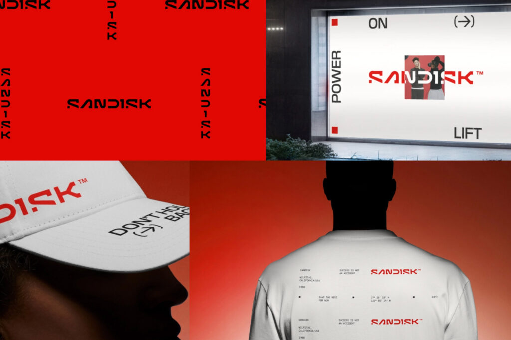
The Key Typography Choice
The newly unveiled SanDisk identity leans into unconventional letterforms to express innovation, speed, and a forward-thinking ethos. While still professional enough to suit enterprise clients, you’ll notice some quirky details that break from the old, rigid style. Angles might be sharper, curves might be a bit more pronounced, and certain letters are styled in a way that suggests motion or cutting-edge design.
Why This Matters
- Differentiation: SanDisk competes with companies like Samsung and Lexar; a more memorable typeface sets them apart on packaging and advertising.
- Subtle Funkiness: The typeface isn’t outrageous—it’s not full of wild swashes or bizarre ligatures—but it pushes just enough boundary to convey a fresh, updated vibe.
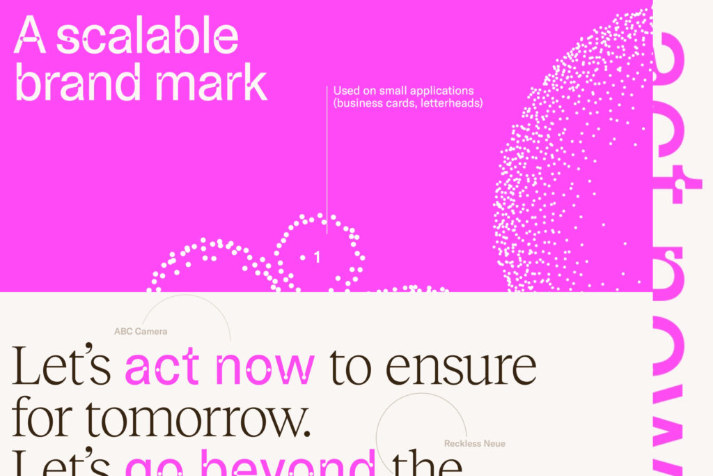
- Scalability: SanDisk’s brand system is used on everything from microscopic product labels to large trade show banners. A well-designed, distinctive type needs to scale while remaining recognizable.
The result is a perfect compromise between corporate utility and creative flair. It’s a blueprint for how established companies can adopt a bit of funk without alienating their core audience.
Conveying Tone Through Type
So what exactly makes a funky typeface convey a particular tone, and how can you leverage that for your own brand? The secret lies in understanding how each design decision in a typeface can create a visual voice.
- Serifs, Sans-Serifs, and Beyond: Serifs can evoke tradition and trustworthiness, while sans-serifs often feel modern and clean. For a funky vibe, consider serif typefaces with exaggerated feet or sans-serifs with playful curves and unusual proportions.
- Weight & Contrast: Heavier fonts can feel bolder and more confident. High-contrast letterforms (thin meets thick) can appear elegant or even flamboyant. Think about how these qualities align with your brand message.
- Spacing & Alignment: Kerning, tracking, and leading (line spacing) can significantly change how “open” or “tight” your design feels. If you want a breezy, airy vibe, give your letters room to breathe. If you want urgency, tighten it up for impact.
- Case Usage & Letter Shapes: All-caps can come across as strong or even shouty. Lowercase can read as friendly or approachable. Mixing it up (small caps, or a single capital letter in an otherwise lowercase word) can add quirkiness without going overboard.
When used wisely, these elements form the backbone of a brand’s typographic identity. They ensure that even a single word set in your brand’s typeface instantly conveys the right mood.
Funky Fonts as the Foundation for a Greater System
One common misconception is that a “funky” typeface can only be used in flashy headlines or one-off marketing stunts. But the truth is, unusual typefaces can absolutely form the backbone of an entire brand system, as long as you build your guidelines with care.
- Hierarchy: Maybe you have one super-expressive display type for headlines, and a more neutral but complementary font for body text.
- Color Palettes: Bold type often pairs well with vibrant color. Just make sure to test readability.
- Graphics & Icons: If your letters have a certain weird shape, you can riff on that for secondary graphic elements, shapes, or iconography.
- Motion & Animation: A typeface with funky curves can be easily animated for social posts or digital billboards, creating an engaging, cohesive brand moment.
When it all comes together, you’re not just slapping a weird font on your ad and hoping for the best. You’re crafting a system that tells a story from top to bottom, whether on a business card, a web banner, or a physical storefront.
Pitfalls & How to Avoid Them
Of course, the danger with pushing the boundaries is, well, pushing them too far. Sometimes a strange typeface might clash with your brand’s actual personality or overshadow important messaging. Here are a few ways to keep things in check:
- Test, Test, Test: Before rolling out a funky font across all your materials, see how it looks in different contexts (digital, print, big, small, etc.).
- Feedback: Gather opinions from your team or even a small user group. Do they find the type intriguing, confusing, or off-putting?
- Accessibility: Quirky letterforms can sometimes challenge readability, especially for users with visual impairments. Consider employing accessibility best practices like adequate color contrast and legible letter spacing.
- Brand Alignment: If your product is all about serious data security, maybe a kooky font with dripping letterforms isn’t the best fit. Strike a balance that respects your core values.
Just because a font looks awesome in a vacuum doesn’t mean it’s right for your brand. The real trick is finding a type style that’s as unique as you are—and still conveys the right messaging.
Bringing It All Together
So, are we saying every brand should ditch their traditional typeface and leap headfirst into a carnival of swirling letterforms? Not necessarily. The real message is that considered, distinctive typography can be a powerful secret weapon—especially if you’re fighting for attention in competitive markets.
- Relevance: Make sure your funky font aligns with your brand DNA.
- Purpose: Use the typeface to reinforce your message, not to hide it.
- Strategy: Incorporate it into a wider system of design elements for maximum impact and consistency.
Final Thoughts: Dare to Be Different
When done right, a weird and wonderful typeface can become your brand’s own version of that city-corner paperboy, shouting your headlines loud and proud. And in a world brimming with white noise, having a typeface that says, “Hey, look over here!” might be just what your brand needs.

