PopFizz Managing Partner Bryan Allen Exits After 14 Years
KNOXVILLE, TN — Designsensory, a Knoxville-based integrated advertising agency, founders Joseph Nother and Brandon Rochelle have acquired full ownership of production company PopFizz, ushering in a new era of integrated storytelling. PopFizz was co-founded by Nother and Rochelle with longtime partner Bryan Allen. After 14 years as managing partner, Allen is stepping away from production to pursue new ventures in technology and real estate development.
“Bryan helped define the voice and vision of PopFizz,” said Rochelle. “His love of visuals and storytelling shaped the company from day one. We’re proud of what we built together, and ready for what’s next.”
Over the past decade, PopFizz has produced nationally recognized content across advertising and entertainment. That includes branded and original series like Tennessee Uncharted on PBS, Lil Jon Wants To Do What, Remastered and Let Them Be Naked: A Documentary on Sustainable Fashion—as well as commercial and campaign work for NASCAR, Bush’s Beans and Dollywood. The team has also contributed to programming for Warner Bros. Discovery, including Love It or List It, Food Network Kitchen, Handmade, HGTV Happy, Bargain Mansions, Unspouse My House and more.
Under full Designsensory ownership, PopFizz will continue to operate independently with a sharper focus on content that blurs the line between advertising and entertainment. The acquisition also brings the production arm closer to Designsensory’s core, creating a more unified engine across brand, strategy and story.
“We’re not merging functions, we’re building momentum,” said Nother. “From small screens to cinema, this is about moving faster, creating with intention, channeling culture and capturing attention where it matters. We’re also leaning into AI and emerging tech. Not to replace craft, but to accelerate it. It’s about augmenting skills, empowering creators and giving auteurs and brands alike the tools to tell sharper, more human stories—faster and with greater relevance.”
The acquisition positions the Designsensory-PopFizz group to compete more aggressively across commercial, branded and entertainment categories, as demand grows for integrated storytelling that lives across platforms, from 15-second verticals to full episodic formats. The move further strengthens the group’s broader storytelling ambitions, which also include Good Gravity Entertainment, a co-owned venture focused on original content development across TV, streaming and digital-first platforms.
Kristin Majni will continue to serve in a senior leadership position as Director of Operations for PopFizz and remains the primary contact for all business, partners and vendors. PopFizz remains headquartered in Knoxville, TN, with no planned staff changes.
We’ve come a long way from a spark of an idea in 2000. What started as a small crew with big ambition has grown into a full-force team pushing brands to think sharper, work smarter, and connect deeper.
This August, we’re celebrating 24 years of bold ideas, better outcomes, and the people who make both possible.
From industry wins to personal milestones, here’s what’s been fueling us lately:
🏆🎥🎙️ Big Wins, Big Moments.
Year 23 ended on a high note. We brought home a National Silver Addy for our out-of-home installation with Regal in Times Square and snagged a Webby People’s Voice Award with Jaymee Sire for Food Network Obsessed.
Great work isn’t the exception; it’s the expectation.
🌭🍸✈️ Eat Up
Over at the office, we had our fair share of hot dogs, martinis, and hot dog martinis (in that order).
But out of the office, Ryan and Lauren hit the Wall Street Journal’s Food Forum and had some dishes that might have outshone our hot dogs. Alongside their expanded palette, they brought back fresh takes on the future of the food and beverage category. Not just what’s trending, but what’s next. If you haven’t read our 2025 Food & Beverage Trends Report, fix that. You’ll be smarter (and hungrier) for it.
Meanwhile, our team headed west to South Dakota, capturing golden-hour content with the Governor’s Office of Economic Development. Think cows and crops, ingenious operations, hardworking farmers and agriculturalists, and wide-open skies—real scenes that reflect the heart, soul, and grit of the state.
🎉🍾🎈Woo-hoo-worthy Wins
The celebrations haven’t stopped, and honestly, why should they?
Hunter Foster, our VP of Media, made it official and tied the knot. And Isabella Cornaby is up next!
Jessica Thompson is gearing up for baby #2 in September (future media strategist in the making?).
And if that’s not enough to cheers to, how about these anniversary milestones:
Michael Pryfogle — 21 years
Hunter Foster — 10 years
Chris Wise — 8 years
Ryan Lee — 7 years
Barry Hylton — 6 years
Madelyn Cunningham — 6 years
Chelsea Penticuff — 4 years
Jessica Thompson — 4 years
Courtney Borgers — 4 years
Lindsay Jones — 2 years
That’s 73 combined years of talent, tenacity, and inside jokes we can’t print here.
We’re grateful for every single one of you.
🚀 Onward
If the last 24 years have taught us anything, it’s this: momentum matters. We’re building brands that move people—and we’re just getting started.
Thanks for being part of the ride. Let’s make year 25 our boldest yet.
The digital landscape is a jungle. Businesses are constantly hunting for flexible, high-performance content platforms that play nice with modern development frameworks. And let’s be honest, getting those platforms to actually perform and integrate without becoming a black hole for your budget is the real challenge.
This is where Sitecore XM, particularly when paired with Sitecore’s JavaScript Services (JSS) React in a headless setup, offers a powerful solution. It’s a scalable, decoupled architecture, perfectly suited for the demands of the modern cloud-first environment. While Sitecore boasts powerful capabilities, its full potential is only realized when implemented correctly. We’ve seen firsthand how teams can struggle with complex integrations, leading to budget overruns and underutilized features. A powerful platform should be an asset, not a resource drain.
A critical consideration right now is Sitecore’s product support lifecycle. For companies still operating on Sitecore 9.3, a vital deadline approaches: Extended Support ends on December 31, 2025. Beyond this date, your Sitecore instance will no longer receive essential security patches or bug fixes, introducing significant risks and increasing maintenance complexities. Upgrading to Sitecore XM 10.4 is therefore not just an enhancement; it’s a strategic imperative for maintaining security, optimizing performance, and accessing the latest features.
Designsensory specializes in transforming these digital challenges into real-world success. Our recent Sitecore upgrade for Bush’s Beans, migrating them from Sitecore 9.3 to 10.4, demonstrates our practical expertise. We streamlined existing services, removed unnecessary third-party functions, and optimized code for enhanced performance, achieving +2 React Versions, 400+ React Files Upgraded, and a remarkable +50% Page Size Reduction. This comprehensive rebuild was managed outside of production to minimize risk, ensuring a robust and modern Sitecore platform for future growth without disrupting live operations.
In light of upcoming support deadlines, we’ve compiled some frequently asked questions that clients often have about embracing this powerful solution:
Q: What is “headless” Sitecore, and why is it beneficial for my business?
A: Headless Sitecore separates the content management system (CMS) backend from the frontend presentation layer. Sitecore XM 10.4 fully supports this architecture through Sitecore Headless Services, allowing developers to use modern frameworks like React via Sitecore JSS. This decoupling offers significant advantages for businesses:
Agility and Speed: Backend and frontend teams can work independently and in parallel, drastically speeding up development cycles and time-to-market for new feature and campaigns.
Omnichannel Reach: Content can be retrieved flexibly through RESTful and GraphQL APIs, making it truly “write once, publish everywhere” – accessible for any channel or device (e.g., websites, mobile apps, IoT devices, smart displays).
Future-Proofing: By separating the presentation layer, your digital platform remains adaptable and resilient to changing technologies. You can swap out or upgrade your frontend framework without rebuilding your entire CMS.
Developer Empowerment: Developers can leverage popular, modern frameworks like. React and Next.js, using familiar tooling and workflows, which attracts top talent and boosts productivity.
Enhanced Performance: Headless architectures often lead to faster loading times and more dynamic user experiences, crucial for SEO and user engagement.
Q: Why is upgrading to Sitecore XM 10.4 particularly urgent for companies currently on Sitecore 9.3?
A: For companies still running Sitecore 9.3, the need to upgrade is immediate. Sitecore 9.3’s Extended Support ends on December 31, 2025. This is a critical deadline because, after this date, your Sitecore instance will no longer receive vital security patches or official bug fixes from Sitecore. Continuing to operate on an unsupported version carries significant risks:
Increased Security Vulnerabilities: Without official patches, your platform becomes a prime target for cyber threats.
Higher Maintenance Costs: Resolving issues without vendor support can become complex and expensive.
Compatibility Issues: Older versions may struggle with new browsers, operating systems, or third-party integrations.
Lack of Innovation: You’ll miss out on new features, performance improvements, and ongoing advancements in the Sitecore platform. Proactive migration to 10.4 ensures your digital investment remains secure, performs optimally, and can leverage all the latest advancements, well before your current version becomes a liability.
Q: How does deploying Sitecore XM headlessly on Microsoft Azure enhance scalability and performance for enterprises?
A: Deploying Sitecore XM headlessly on Microsoft Azure ensures enterprise websites and applications can scale effortlessly, handling even the most demanding traffic. Our experience shows how Azure complements Sitecore’s power:
Elastic Scalability: Azure App Services can quickly scale up or down automatically to meet fluctuating demands, ensuring your website or application performs optimally during peak traffic or sudden campaigns.
Global Reach & Speed: Services like Azure CDN (Content Delivery Network) and Front Door improve global load times by efficiently offloading static and cached content, delivering it from servers closest to your users worldwide.
Operational Efficiency & DevOps: Seamless integration with Azure DevOps pipelines and GitHub workflows enables automated code standards verification and continuous deployment of both frontend and backend environments, leading to more reliable and frequent updates.
Q: What tools does Sitecore 10.4 offer for streamlined local development and team collaboration?
A: Sitecore 10.4 provides robust, built-in tools that simplify onboarding and streamline workflows, making development more efficient and consistent for teams of all sizes:
Docker Containers: Developers can quickly spin up complete, isolated Sitecore XM environments locally using official Docker images. This dramatically reduces setup time and ensures consistency across different development and testing environments.
Sitecore Content Serialization (SCS): This critical feature allows teams to version and transport content and template items as part of their source code. This enables true DevOps practices and continuous integration/continuous deployment (CI/CD) pipelines, ensuring content consistency and version control alongside code. For Bush’s Beans, updating and reworking existing Sitecore serialization was a complex but vital “behind the scenes” effort that ensures consistency and version control.
Real-Time Content Access (JSS Connected Mode): Frontend developers can quickly preview production content by connecting to the Production Content Delivery Server without needing a full Sitecore installation. This also allows for efficient testing with various browsers and devices, including Apple hardware.
Rapid Prototyping: Components can be built and tested against actual data early in the development cycle, speeding up the design-to-delivery process. This was invaluable for projects like Bush’s Beans, enabling quick and confident iterations.
Q: While Sitecore is powerful, how do we ensure it doesn’t become a resource drain or overly complex?
A: This is precisely where our certified Sitecore guidance becomes invaluable. While Sitecore XM 10.4 in a headless configuration offers a future-ready content management solution, without the right expertise, teams can get bogged down by custom modules, fragile integrations, and unused features, diverting budget from progress. We simplify this complexity, ensuring powerful tools don’t overwhelm your team, optimizing costs by pruning unnecessary integrations and fine-tuning caching and image generation for tangible value. Our expertise smooths the developer experience through GitHub workflows and Sitecore Headless decoupling, while strategically navigating Azure DevOps for secure, scalable deployments, ultimately accelerating your Sitecore instance’s impact and making your brand impossible to ignore.
Ready to Elevate Your Digital Experience?
The digital landscape is evolving rapidly, and staying ahead means embracing powerful, flexible solutions like Sitecore XM 10.4 with React Headless. As the December 31, 2025, support deadline for Sitecore 9.3 looms, upgrading isn’t just an option—it’s a strategic imperative for security, performance, and innovation.
At Designsensory, we don’t just implement technology; we transform digital challenges into real-world success, as demonstrated by our comprehensive Sitecore upgrade for Bush’s Beans. We help you unlock Sitecore’s full potential, ensuring your platform is an asset, not a drain on resources.
Is your Sitecore instance ready for the future? Don’t let unsupported versions or complex integrations hold you back. Reach out today for a strategic consultation on upgrading to Sitecore XM 10.4 and harnessing the power of headless architecture.
Speed takes the blame when tech projects derail. But speed isn’t the problem—it’s rushing. Urgency has focus. Rushing doesn’t. It skips strategy, cuts corners, and defers clarity like it’s optional.
We’ve seen what happens when deadlines drive the work: specs half-written, UX tacked on, teams scrambling. Maybe it ships. Then come the patches, the rework, the regret.
A fast launch feels good—until the costs hit. Not up front. After. In trust. In performance. In momentum. We ran the numbers on what rushing really costs, because sometimes, you truly just need to see the facts.
Technical Debt from Rushed Builds
Shortcuts today become tech debt tomorrow. When teams rush development, they trade time for rework. According to Stripe, developers spend 42% of their week—about 17 hours—on maintenance and tech debt. That adds up to $85 billion in lost productivity each year (tiny.cloud). Every hour fixing bugs is an hour not spent building something new. The cost isn’t just in time—it’s in lost innovation (tiny.cloud).
Maintenance costs add up fast. In 2023, research showed that teams spend about $306,000 a year—or 5,500 developer hours—cleaning up technical debt in a codebase with 1 million lines (sonarsource.com). Left unresolved, that climbs to $1.5 million over five years (sonarsource.com). The message is clear: the “interest” in rushed work compounds.
Quick fixes come with a heavy price. McKinsey reports companies spend 10–20% more on every new IT project just to patch around existing tech debt (mckinsey.com) One company learned the hard way: years of rushing led to such tangled systems that a modernization effort ran $400 million over budget. They canceled 25% of planned improvements—yet even after pouring in another $300 million, only half the updates were delivered two years later (mckinsey.com).
Website Performance Pitfalls of Rushed Development
A site that lags loses users fast. When performance optimization gets skipped, load times drag and conversions drop. Studies show a 7% decline in conversions for every additional second of load time (thrivemyway.com). In the first five seconds, each delay cuts conversions by about 4.4% (thrivemyway.com) For an e-commerce site pulling in $100,000 a day, that one-second lag can mean $2.5 million in lost sales per year (outerboxdesign.com). Users won’t wait—they’ll walk. And once they’re gone, they rarely come back.
Performance isn’t a nice-to-have; it’s a business imperative. Bounce rates increase by 32% when load time climbs from 1 to 3 seconds—and by 90% from 1 to 5 seconds (thrivemyway.com). Nearly half of users say they won’t revisit a site that loads poorly (outerboxdesign.com). Even a single second of delay drops customer satisfaction by 16% (outerboxdesign.com). You’re now looking at lost loyalty, conversions, and long-term value. And since page speed directly impacts SEO, a slow site won’t just frustrate users—it’ll bury your visibility, too.
Compressed Timelines and Project Outcomes
“Deadline at all costs” can backfire. When timelines compress, quality assurance is often the first to go. And the consequences can be catastrophic. Take Samsung’s Galaxy Note 7. In the rush to beat Apple to market, Samsung launched early—just a month ahead of the iPhone (techtarget.com). Testing and quality control suffered. Exploding phones, a global recall, and over $3 billion in immediate losses—plus an estimated $17 billion in long-term damage to the product line (techtarget.com). As one CIO put it: “Rushing product development is less a tech issue and more a quality control issue” (techtarget.com).
Speed without quality rarely wins. In a 2021 survey, 56% of IT leaders admitted their teams prioritize speed over quality (tricentis.com). Nearly half believed that decision had cost them revenue. Bugs, crashes, and slow performance erode trust. If a product underdelivers, it misses the point entirely.
Deferred work becomes debt—and debt snowballs. Tight deadlines don’t eliminate problems; they bury them. Anything unfinished gets pushed to the backlog, otherwise known as a “mountain of debt” (smashingmagazine.com). The result? A system held together by quick fixes. Speeding up again only makes it worse. As one developer put it, “The company can’t pull over to fix the wheel because customers expect it to keep moving” (smashingmagazine.com). When you’re always racing, you never get time to repair. And what starts as a shortcut becomes a slow bleed of breakdowns, rework, and rising costs—often when you can least afford them.
Expert Insights on Speed vs. Quality Tradeoffs
Short-term speed can sabotage long-term growth. As software architect Mohit Kanwar puts it, “When we prioritize speed over quality and skip essential processes, we are merely borrowing time from the future” (linkedin.com). The hours saved now come back later.
This isn’t just theory. It’s a known pattern. TinyMCE warns that rushed development creates technical debt that eventually overtakes growth efforts—slowing progress and delaying releases (tiny.cloud). McKinsey calls technical debt the “silent killer” of modernization—an anchor that drags harder the longer it’s ignored (mckinsey.com).
Choose Fast. Not Fragile.
It’s clear: Quick-and-dirty builds don’t save time—they borrow it. And you’ll pay it back with interest. As engineers say: “There’s never time to do it right, but always time to do it over.”
So let’s build with urgency, not chaos. Let’s launch with confidence, not cleanup crews. Because when it’s done right, fast and future-proof aren’t opposites—they’re inseparable.
At Designsensory, we move fast because we do the groundwork first. Strategy aligned. Assumptions tested. Performance designed from the start. Speed isn’t our goal—it’s the byproduct of doing things right.
Stop confusing “done” with “ready.” Let’s build something that lasts. And let’s do it fast—the right way.
New Palates, New Playbook: Decoding 2025’s F&B Rules.
The global food and beverage industry is undergoing a seismic shift. Consumer values are recalibrating, technology is reshaping every touchpoint, and the definition of “health” is expanding. If you’re still operating on yesterday’s assumptions, you’re missing the future.
Our research arm, Designsensory Intelligence, has meticulously analyzed the data. The result: a sharp, clear look at where food and beverage is headed next, so you can lead, not just react.
Key shifts we uncovered:
Consumer Trust is Brittle. Only 62% of consumers trust the U.S. food supply, down sharply from 70%. Transparency in labeling, safety protocols, and sourcing isn’t optional.
Fast Food Pricing is Breaking Perception. 47% price growth in the last decade has reshaped how consumers view quick service—80% now see it as a luxury. Value menus are a strategic defense against churn.
Plant-Based Isn’t Niche. With an 11.5% CAGR through 2030, plant-based is now a structural shift, not a fad. This is about mass adoption, not vegan identity.
The takeaway: If your brand isn’t adapting to these fundamental shifts, you’re not just behind—you’re getting left behind.
Want the full breakdown?
Download the full 2025 Food + Beverage Trends Report for deeper insights, sharper data, and smarter next steps to own the future of food.
If you want to know where the economy is headed, just open TikTok.
Or Instagram. Or YouTube. Or Facebook. Or X.
A (not so) quiet storm is building across social media. You’ve probably seen it: young Americans labeling everything from grocery prices to fast fashion knockoffs as a “recession indicator.” Not in the CNBC sense, there’s no talk of yield curves or Q3 projections. This is the crowdsourced, cultural version of a recession indicator.
Let’s be honest, these posts are oftentimes just cultural commentary, not macroeconomic forecasting. But brands can’t afford to wait for official confirmation of a downturn. Perception is reality. If people feel like we’re in a recession, they’ll act accordingly and expect brands to respond.
So, how do people feel? Are these things (and more) all signs of an impending recession?
Welcome to the aesthetics of economic uncertainty.
Many people start the conversation by pointing to fashion. Hemline Theory, a long-standing idea that skirt lengths correlate with market health, predicted the drop. And sure enough, they’re falling. Not just hemlines, but color and personal styles.
Trends like Clean Girl, Old Money, Trad Wife, Quiet Luxury, Office Fetish — and “Business Casual in the Club” — don’t just reflect style shifts. They signal economic and cultural contraction. Conservatism, financial and aesthetic, is in.
Fast fashion knows this, and it’s playing along by mimicking luxury marketing while keeping product quality bargain-bin. Aesthetics of wealth, without the cost.
But how are consumers responding? By turning the middle class into the new aspirational class.
Capsule wardrobes. Natural hair. Earth-tone neutrals. Survival—financially, emotionally, aesthetically—has been the trend. And there’s plenty of content to prove it.
Eggs and a strawberry. The fridge is restocked.
Of course, people are also quick to point to food as proof of a recession.
In March 2025, The Ordinary, which is known for minimalist skincare and under-$10 serums, started selling eggs. Real ones. In-store. In Manhattan. Branded and shelved like moisturizer.
Why? Because egg prices were surging due to a bird flu outbreak. Some supermarkets were charging nearly $12 a dozen. The Ordinary undercut Trader Joe’s by $2 and made a bigger statement than any billboard: We understand inflation and we’re not pretending it’s business as usual.
Of course, it’s a stunt, and some called it tone-deaf. Others called it genius. Either way, it worked. When skincare brands start selling groceries, the line between product, politics, and performance completely blurs.
Back in February, one single strawberry was being sold for $20. At Erewhon, the California-based luxury grocer, naturally.
The Tochiotome strawberry is imported from Japan in a plastic jewelry box. It’s fruit as fashion. A clout-chasing grocery item for people who eat aesthetics.
In a time when food insecurity is rising and grocery staples feel out of reach for many, Erewhon turned nourishment into a luxury good.
And people couldn’t stop posting about it.
Let’s go even further back, back to 2020, and look at TikTok’s restock trend, an ASMR-driven frenzy of fridge organization, color-coded cereals, and curated abundance. It’s calm. It’s tidy. It’s also deeply revealing.
As mentioned in a Vogue article, we fetishize control when life feels out of control. We perform stability through pantries when real security is slipping further away. This isn’t just about being neat. It’s a soft scream for order in a chaotic economy.
Coincidentally, this trend boomed during the last recession, and it’s sticking around.
Recession Pop: The Remix
Music is following suit, too. Just like the 2008 crash brought us Lady Gaga, Pitbull, and “Just Dance” energy, 2025 has ushered in its own wave of similar music that’s high-gloss, high-energy, deeply unserious, and totally necessary.
It’s Recession Pop 2.0: Charli XCX, Chappell Roan, Sabrina Carpenter. Even dubstep is back. Because when reality sucks, escapism sells.
The FADER notes of the pattern: economic downturns trigger musical upticks in energy. Pop becomes refuge. Fun becomes protest.
But escapism isn’t limited to music. Look at The Pitt — grounded, competent people trying to fix a broken system. Or Severance — the anti-capitalist fever dream. Or White Lotus — aspirational rot in paradise. This isn’t mindless media. It’s wish fulfillment and a coping mechanism rolled into one.
No Buy 2025 is the biggest signal yet.
No Buy 2025 started as a personal finance challenge: buy nothing but essentials for a year. But when it spreads to millions, it stops being a challenge and becomes a cultural alarm bell.
This isn’t virtue signaling, it’s financial triage. Gen Z isn’t just budgeting better. They’re opting out of a broken cycle. No more project pan. Now it’s full-on abstinence from anything non-essential.
When culture treats consumption itself as the enemy, the economy is already in peril. It just hasn’t been officially labeled as such yet.
So what can brands do about it?
Here’s how to meet the moment:
Relatability > Luxury: Don’t sell a dream—sell small, daily wins. Think Aldi, not Erewhon. (Aldi’s strategy is working too.)
Value Signals Matter: If you’re premium, prove it. If you’re budget, own it. Middle-tier “meh” is where brands fizzle.
Rethink Your Influencers: Consumers don’t want gods. They want guides. Someone just one step ahead, not 10 stories up. You’ll see countless creators recapping their success to others with the advice to let their followers grow alongside them.
Make Restraint Look Good: Aesthetic frugality is in. Minimalist packaging. Transparent pricing. No-BS messaging. Make it feel like a choice, not a compromise.
Give People Control: Empowerment is everything. Whether it’s customizable bundles or smart DIYs, help people feel savvy, not sold to.
The bottom line? Culture knows what the numbers don’t or won’t say. And right now, it’s not just reacting to the economy, it’s diagnosing it. So pay attention and listen up!
Accessibility overlays are everywhere—and they’re failing silently.
As digital accessibility lawsuits climb, overlays promise an easy way out: slap on a widget, claim compliance, and move on. But the reality is murkier. These tools often add barriers instead of removing them. Worse, they give website owners a false sense of security while leaving users frustrated—and vulnerable to legal risk.
Let’s look beyond the sales pitch and break down what overlays actually do, what they don’t, and why relying on them may cost more than they save.
What are accessibility overlays, and how do they work?
In this case, “overlays” broadly refers to solutions that apply third-party code to the front end of your website to make improvements and change appearance and functionality. These solutions can also be referred to as plugins, widgets, or tools. Popular accessibility overlays include UserWay, AccessiBe, and AudioEye. These overlays typically allow users to change fonts, colors, text size, and similar aspects of the website, and they work by modifying the code on the page with JavaScript. Many of these solutions make claims that using them will make your website accessible without having to do any additional work, and some also claim to detect and proactively fix accessibility issues on websites using AI. Website owners often turn to these solutions as protection against accessibility lawsuits, especially since the number of lawsuits over digital accessibility has increased sharply over the last few years. In 2021 alone, the most prolific year for WCAG and web ADA-related lawsuits, there were a record 11,452 suits filed. The ease of filing these lawsuits makes it especially important to make sure that your digital experience meets the appropriate standards.
Do overlays make your website fully accessible?
Web Content Accessibility Guidelines, or WCAG, are the set of standards used to determine website accessibility. WCAG standards require visual accessibility, such as sufficient contrast for text, but also include extensive technical requirements so that websites are usable with assistive technology like screen readers. Overlays are unable to fix these background technical requirements because they don’t address issues in the source code of the website.
Unfortunately, overlays can miss a lot of accessibility issues. Since they are just adding on to the existing code, they can’t fix the underlying errors. They also can’t fix inaccessible content.
Here are some examples of issues that overlays won’t help:
Missing or incorrectly coded content headings
Unclear or missing link text
Missing alt text on images
Form field errors, including missing labels, no indication for required fields, or unclear submit buttons
Missing audio or video captions or descriptions
Since overlays are automated solutions, they lack manual testing and remediation. It is estimated that automated tools are able to detect only about 30% of WCAG errors, so no matter what, many issues will be missed unless manual testing is done, which would make the overlay redundant. Many consider overlays to be a “band-aid” solution only, while a company actively works to remediate errors across web properties.
These gaps can leave difficult barriers for users with disabilities to navigate. Because overlays are marketed as making your website accessible, website owners assume they no longer have issues, when in fact, these inefficient solutions are leaving them open to lawsuits. According to UsableNet’s 2023 Digital Accessibility Lawsuit Report, 30% of all digital accessibility lawsuits involved websites with overlays, a 60% increase for that year. UsableNet’s 2024 Year-End Report found that over 1,000 lawsuits were filed against websites using overlays. In some instances, just using the overlay could make a website an easy target for a lawsuit, as it is easy to find lists of websites using various accessibility widget solutions, and firms may use these lists to find targets.
The overlay vendors themselves are also open to lawsuits and complaints. On January 3rd, 2025, the FTC required AccessiBe to pay $1 million for deceptive claims that its AI product could make websites compliant with accessibility guidelines. According to the press release, AccessiBe “misrepresented the ability of its AI-powered web accessibility tool to make any website compliant with the Web Content Accessibility Guidelines (WCAG) for people with disabilities.” This is likely to make websites using AccessiBe (and other overlays) even bigger targets, since this order specifically states that the overlays do NOT make websites compliant with WCAG.
Do disabled users use overlays?
Many disabled users actively block overlays because they can actually make it more difficult to navigate a website, especially when users already have preferred assistive technology. Overlays can fail to adapt to a user’s specific assistive technology, such as screen readers. Users relying on assistive technology already have their devices and browsers configured to their desired settings. In some cases, overlays override these settings and force them to use the overlay. A 2021 WebAIM survey found that 67% of users rated “overlays, plugins, and widgets for accessibility” as not effective, and the percentage increased to 72% in users with disabilities.
What other impacts can overlays have on your website?
Overlays can impact the overall performance of your website. Since overlays and plugins are using additional scripts hosted on third-party servers, they can be slow to load, and you have no control over it. If an overlay is resource-intensive and slows your website speed, it will degrade the experience for all users, who are very unforgiving of slow websites. Not only that, but Google uses website speed as a ranking factor, so overlays could cause fewer visitors overall.
Accessibility overlays can also impact a website’s security. Allowing third-party vendors to inject code into your website carries inherent security risks. In addition, some vendors may set cookies to allow preferences to “follow” a user to different websites, or use other tracking capabilities to collect browsing data. According to Overlay Fact Sheet,
“Overlays that automatically enable certain settings, like those for screen reader or speech recognition users, do so by detecting when an assistive technology is running on the device. This exposes the fact that the person using the device at the time has a disability. In certain cases, like screen reader users where the majority are blind or have low vision, it exposes even more detail about the nature of their disability. Like age, ethnic background, or preferred gender, disability is sensitive personal information. It is not data that should be collected without the informed consent of the person it belongs to.”
Overlay Fact Sheet also found that typically, users did not opt-in and are unable to opt-out of being tracked, which creates risk for the website owner to be found in violation of GDPR and CCPA.
So, how do you actually make your website accessible?
The most efficient, effective way is to build accessibility in from the start. But even if a rebuild isn’t on the table, you’re not stuck. Remediation is possible—and necessary.
Our accessibility and UX experts at Designsensory can run a full manual audit to uncover the issues overlays miss, then guide your team with practical, maintainable solutions. We don’t just scan and report—we train, test, and implement to ensure real compliance, not performative fixes.
Want to start today? Tools like WAVE by WebAIM and axe DevTools by Deque Systems can help you spot obvious issues in-browser, privately and securely. But remember: automated checks only go so far. Real accessibility requires human eyes and hands.
We’ve helped make everything from small tourism sites to enterprise health systems fully WCAG-compliant—and we can help you do the same.
If you’re ready to move beyond checkbox compliance and build something that actually works for everyone, get in touch. We’ll help you get it right.
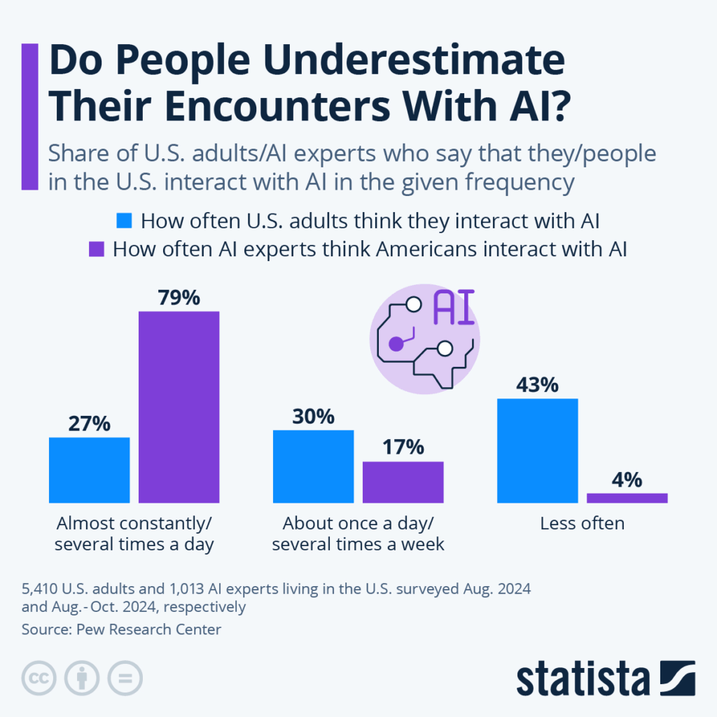
If you’ve scrolled LinkedIn lately, you’ve noticed: AI isn’t some freaky sci-fi future anymore. It’s running in your inbox, your CRM, your Spotify queue. And brands aren’t dipping toes in—they’re all in.
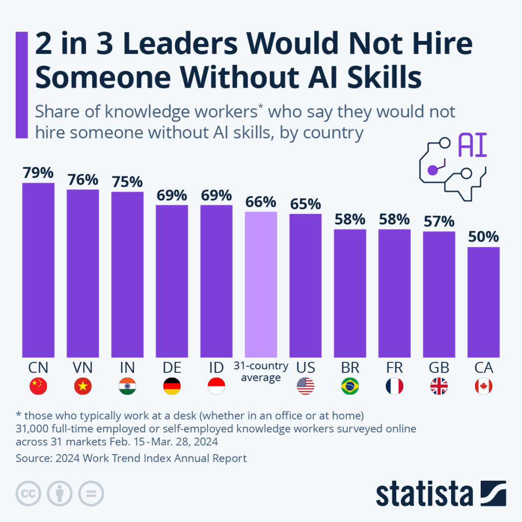
According to McKinsey, 78% of companies are using AI in at least one business function. Meanwhile, Big Tech is poised to drop over $320 billion on AI next year. That’s not a trend. That’s a business model shift. And a global-average 66% of leaders say they wouldn’t even hire someone who wasn’t proficient in using AI.
We use AI at DS, too, because it helps us move faster, test smarter, and scale what works. But speed is only valuable if you’re still steering.
The ethical risk isn’t that AI makes things too easy; it’s that it makes the wrong things feel efficient. Replicated ideas. Misaligned messaging. Work that skips the hard thinking.
We don’t use AI to skip steps. We use it to spend more time on the steps that matter.
I sat down with a few folks across our teams to get specific about the tools we’re using, the ones we’ve scrapped, and how we keep the “sense” in Designsensory with firsthand answers from:
Jessica Thompson (Media Director)
Chris Cable (VP, Creative)
Stephan Zerambo (VP, Interactive)
Hunter Foster (VP, Media + Comms)
What AI tools do you and your team use directly?
Jessica “ChatGPT. Some of our team uses it to reword clunky sentences or proof short blocks of copy—just as a second set of eyes, not the lead author. It’s helpful for making sure a paragraph holds up or flows the way we want.”
Chris “We use a handful of tools to speed up concepting and kill busywork.”
ChatGPT / Gemini – For brainstorming, writing drafts, tone/voice calibration
DALL·E / Midjourney – For early-stage visual concepts and moodboards
“Right now, we’re experimenting with Sora for video comps. Still unpredictable, but interesting.”
“The throughline is speed. These tools help us skip the friction and get to the good stuff.”
Stephan “On the interactive team, ChatGPT’s a go-to for dev help. Think: debugging, quick code stubs, ‘What’s causing this React hydration issue?’ Copilot helps generate test cases, scaffold components, even translate data formats. It’s not perfect, but it gets us 90% of the way, which saves a ton of time.”
Sentry flags bugs and suggests likely root causes
Gemini is creeping into Google Workspace for quick replies, summaries, and content blocks
Jasper + Grammarly help with quick content edits outside of dev
What tools have AI baked in—even if you’re not prompting it directly?
Even if you’re not directly asking something like ChatGPT to write stuff, it turns out AI is way more mixed into our everyday tech than most people realize.
Jessica “Meta has AI that can auto-generate ad versions by swapping creative elements, but we don’t use it much. We want more control.”
Chris “Figma’s starting to roll out AI features like wireframe generation and copy suggestions. Haven’t gone deep yet, but it’s promising. And Adobe Creative Suite is full of Firefly integrations now; it’s low-key making everything faster.”
Stephan “GA4 surfaces trends. WordPress and HubSpot suggest AI-powered content ideas. Figma’s getting smarter. These invisible upgrades aren’t game-changing individually, but they’re stacking up to improve efficiency.”
Any tools you’re watching that could shift how your team works?
Jessica “Copy.ai could be huge for paid search. We need dozens of headlines and descriptions quickly. It could cut down manual writing time big time.”
Chris
Artlist.io for AI voiceover—great when we need quick-turn video
Kaiber / Pika / Wonder Studio for faster motion design workflows
“We’re watching Sora for campaign storyboarding, but it’s not there yet.”
Stephan
Maze / PlaybookUX: AI-powered user testing
ElevenLabs: Synthesized voice for accessibility prototypes
“Some tools are starting to make stack-aware dev suggestions, not just snippets. That’s big.”
Where does AI still fall short?
Jessica “It can’t own anything. It’s helpful at the start or middle of a task, but it’s not built for the finish line.”
Chris “It doesn’t understand timing, taste, or tone. It can’t feel the nuance in a brand’s voice. And clients aren’t prompts, they’re people. AI doesn’t read the room.”
Stephan “AI outputs aren’t production-ready. Code still needs validation. Brand still needs consistency. Strategy still needs a brain. We don’t let tools do the work of thinking.”
Excitements and hesitations?
Jessica “Excited about how it could streamline media processes. Cautious about job impacts. Automation cuts steps, but it can also cut people.”
Chris “It’s a creative accelerator. We’re faster, more personalized, and more experimental. But if everyone uses the same tools the same way, we risk sameness. Our edge comes from how we use it, not that we use it.”
Stephan “Excited to spend less time on repetitive dev work. Concerned about overtrusting outputs that ‘feel’ right but aren’t. And yes, we’re watching ethical concerns and data handling closely, especially in client work.”
Bonus: Hunter on AI in Social
Hunter Foster “Sora’s great for fast social content; it lets us skip steps without losing sharpness. Claid.ai handles visual placement with precision, and Premiere Pro’s generative tools like Remix and Extend have totally changed how we edit. The AI built into Meta and Google Ads is powerful, but we use it selectively. We want to steer the strategy ourselves.”
What This Means for You
AI isn’t here to replace us. It’s here to pressure-test us. To force better questions, sharper thinking, and more responsible output.
We use AI to make the work faster, not cheaper. Smarter,not soulless. It’s a tool, not a substitute. And we hold it to the same standard we hold ourselves: it has to serve the strategy, not distract from it.
The ethical line isn’t whether you use AI. It’s how. Are you chasing shortcuts? Or are you clearing space to go deeper?
At DS, we’re not just keeping pace. We’re making sure every prompt, every output, and every idea still leads somewhere original.
If you’re figuring out where AI fits in your brand’s process, let’s talk about what better looks like.
Tired of the text on your reel clipping into Instagram’s UI? How about when you share multiple photos on Facebook and you can never get the preview just right? Oh, and don’t get me started on cover photos across different devices. Each social media platform has its own nuances and specifications for image sizes and formats. And when you’re creating content for use on multiple platforms, it’s important to understand these specifications to ensure higher utility, less production time, and better social performance.
Safe zones are like designated VIP areas on social media platforms where your text, graphics, and other content can strut their stuff without getting cut off or overshadowed by pesky elements like share buttons or auto-cropped previews. These zones are as unique as the platforms themselves, varying across post types, platforms and devices.
In today’s competitive social scene, where your creative elements land can make or break their performance. Platforms like Facebook, Instagram, and TikTok have their own rulebooks for safe zones, ensuring a seamless user experience. But it’s not just about playing by the rules; it’s about optimizing your content for maximum impact.
By respecting these safe zones, you’re not just following trends—you’re creating content that captivates your audience’s attention, ensuring that their focus is squarely on your message. So, let’s dive into the creative placements on each platform and make sure your content is stealing the spotlight!
Facebook
Facebook is by far one of the most versatile platforms and supports various types of content, including images, videos, and text posts. Properly formatting images for Facebook is like giving your content a spa day—it ensures they appear crystal clear and eye-catching in users’ feeds. And you know what that means? Increased engagement and brand visibility, baby! So, let’s make sure your Facebook game is strong and your content is popping off the screen!
Profile Photo
Aspect Ratio: 1:1 with circular safe zone
Minimum Image Size: 180 x 180 pixels
Recommended Image Size: 1080 x 1080 pixels
Actual size used depends on device and usage:
Desktop: 176 x 176
Smartphone: 196 x 196
Thumbnail: 32 x 32
Recommended File Type: JPG, PNG
The profile picture is located 16 pixels from the left and 176 pixels from the top of your cover photo (on desktop). This is important if you want to create an integrated profile picture/cover photo.
Safe Zone Note: When designing your cover photo, place all critical text and graphics in the central area of the image. The top and bottom will be cropped on mobile devices, and the sides will be cropped on desktop. The 1640 x 720 pixel size ensures that your image looks good on both.
Single Image:
There are 3 main photo ratios for Facebook photos:
Aspect Ratio:
Square: 1:1
Portrait: 4:5
Landscape: 1.91:1
Recommended Image Size:
Square: 1080 x 1080 pixels
Portrait: 1080 x 1350 pixels
Landscape: 1200 x 627 pixels
Maximum File Size: 8MB
Recommended File Type: JPG, PNG
Multiple Images:
The same specifications as single images apply for multiple images. However, each collection of photos shared on Facebook has a unique preview (and safe zone) dependant upon the aspect ratio of the images and the quantity.
Square Images:
One image: 1:1
Two images: Two 1:1 placed side-by-side
Three images: 2:1 on top of two 1:1
Four images: 1:1 in a grid
Five images: Two 1:1 images on top of three 1:1
Six or more images: The same as five images, but the bottom right photo has an overlay displaying the number of additional images.
Portrait Images:
One image: 4:5
Two images: Two 1:2 placed side-by-side
Three images: 2:1 left of two stacked 4:5
Four images: 2:1 left of three stacked 4:5
Five images: Two 1:1 images on top of, three 1:1
Six or more images: The same as five images, but the bottom right photo has an overlay displaying the number of additional images.
Landscape Images:
One image: 1.9:1
Two images: Two 1.9:1 images stacked
Three images: 3:2 on top of two 1.9:1 side-by-side
Four images: 3:2 on top of three 1:1 side-by-side
Five images: Two stacked 1:1 images left of three stacked 3:2
Six or more images: The same as five images, but the bottom right photo has an overlay displaying the number of additional images.
Note: There is an 80 photo limit on each post, but you can create and album to raise that maximum to 1,000.
Link Preview
When sharing a link post on Facebook, a photo will auto populate from the website. Create images for your web page that are at least 1200 x 630 pixels for the best display on high resolution devices.
Instagram
Thankfully, Instagram is similar to Facebook in relation to images, stories and reels. But here’s the magic: Instagram’s aesthetic game is on another level. Properly formatting images here isn’t just about getting it right; it’s about maintaining a feed that’s so cohesive and attractive that it’s like catnip for followers.
Why does this matter? Because a killer feed doesn’t just attract eyeballs—it keeps them glued, boosting your engagement and turning casual scrollers into loyal fans. So, let’s turn your Instagram feed into a work of art that’ll have everyone hitting that follow button!
Profile Picture
Recommended Aspect Ratio: 1:1 with circular safe zone
Recommended Image Size: 320 x 320 pixels, display: 110 x 110 pixels
Recommended File Type: JPG, PNG
Image Posts
Similar to Facebook, there are 3 main photo ratios for Instagram photos.
Aspect Ratio:
Square: 1:1
Portrait: 4:5
Landscape: 1.91:1
Recommended Image Size:
Square: 1080 x 1080 pixels
Portrait: 1080 x 1350 pixels
Landscape: 1080 x 566 pixels
Maximum File Size: 30MB
Recommended File Type: JPG, PNG
When posting a carousel with additional images, Instagram will auto-crop to a square or the first image’s aspect ratio. Ensure all subsequent images have a consistent orientation to avoid awkward cropping.
Note: The iconic square profile grid has been replaced by a new, taller grid that previews all posts in a 3:4 aspect ratio. For this reason, the recommended size for all new content is the 4:5 portrait (1080 x 1350 px). While you can still upload 1:1 square or 1.91:1 landscape images, they will be center-cropped to fit the new 3:4 grid, which may affect their appearance. To ensure your content looks its best, always place critical text and visual elements within the center of the image to accommodate both the new grid and the feed view.
Reels:
Aspect Ratio:
Full-Screen: 9:16
Instagram Feed: 4:5 (slight punch-in)
Recommended Size: 1080 x 1920 pixels
Video Duration:
In-Platform: 15-90 seconds
With Scheduling Tools: 3 seconds – 15 minutes
Video Format: MP4 (recommended) or MOV
Maximum File Size: 650MB for videos less than 10 minutes
Additional Technical Specifications:
Reels should have a minimum frame rate of 30 FPS (frames per second) and a minimum resolution of 720 pixels
Pro Tip: Enable high-quality uploads in your Account settings
Stories:
Aspect Ratio: 9:16
Recommended Image/Video Size: 1080 x 1920 pixels
Maximum File Size:
Image: 30MB
Video: 4GB
Recommended File Type:
Image: JPG and PNG
Video: MP4 (recommended) or MOV
TikTok
When it comes to TikTok, the main event is, without a doubt, the videos. With its interface and platform size requirements similar to Instagram’s, TikTok is a playground for your creativity.
But here’s the deal: just like any good show, your videos need to stay within the safe zone. This ensures they look their best and grab attention in the fast-paced TikTok world. So, let’s make sure your TikTok videos are primed for the spotlight, ready to dazzle viewers and maybe even go viral!
Profile Picture
Aspect Ratio: 1:1 with circular safe zone
Minimum Image Size: 200 × 200 pixels
Recommended Image Size: 1000 x 1000 pixels
Recommended File Type: JPG, PNG
Videos/Photos
Aspect Ratio: 9:16
Recommended Size: 1080 x 1920
Max File Size:
72MB (Android users)
287.6MB (iOS users)
Note: Scheduling tools may allow up to 1GB
Recommended File Type:
Video: MP4 or MOV
Image: JPG, PNG
Video Length:
Up to 10 minutes recorded in-app
Notes: Scheduling tools may allow up to 60 minutes.
Frame Rate: 23-60 FPS
LinkedIn
The digital stage where professionals shine. On LinkedIn, visuals are your secret weapon for showcasing your brand, achievements and thinking in the best light possible.
Given LinkedIn’s high level of professionalism, it’s crucial to ensure that your images and graphics are not just high-quality but also properly formatted. Why? Because every pixel counts when you’re making a positive impression on potential clients, partners, employees or employers.
So, let’s make sure your LinkedIn game is strong, your visuals are top-notch and your professional brand is standing out for all the right reasons!
Profile Picture
Minimum Image Size: 268 x 268 pixels
Recommended Image Size: 1000 x 1000 pixels
Maximum File Size: 3MB
Recommended File Type: JPG, PNG
Cover Photo
Recommended Image Size: 1584 x 396 pixels
Maximum File Size: 3MB
Recommended File Type: JPG, PNG
Safe Zone Note: The left side of your cover photo will be covered by your profile picture. On mobile, 50% of your profile picture will overlap with the cover photo.
Single Image Posts
Aspect Ratio:
Square: 1:1
Portrait: 4:5
Landscape: 1.91:1
Recommended Image Size:
Square: 1080 x 1080 pixels
Portrait: 1080 x 1350 pixels
Landscape: 1200 x 627 pixels
Maximum File Size: 3MB
Recommended File Type: JPG, PNG
Multiple Image Posts
LinkedIn’s Help Center outlines the following specifications for image posts featuring multiple images.
Images will render a max ratio of 4:5 and the post will have a greater visual emphasis on the first image.
The layout of these posts will depend on the height and orientation of the first image uploaded.
Posts with two images will appear side by side and will retain their aspect ratios.
When posts contain three or more images, the way they appear depends on the height and orientation of the first image.
You can add a max of 20 photos in a multi-photo post.
If the first image is square, it will be shown in the left column, with the other images stacked vertically to the right of the first image.
If the first image is a portrait, it will be shown in the left column, with the other images stacked vertically to the right of the first image.
If the first image is landscape, it will be shown at the top, with the other images displayed side-by-side below the first image.
X
On X, every character counts (unless you’re a Premium member, that is), but visuals can speak volumes.
X’s fast-paced, concise nature means that visuals are key to grabbing users’ attention in the blink of an eye. Properly formatted images on Twitter can make your posts stand out in the sea of posts, increasing the likelihood of reposts and engagement.
Profile Picture
Recommended Aspect Ratio: 1:1, 4:5 with circular safe zone
Recommended Image Size: 400 × 400 pixels
Maximum File Size: 5MB
Recommended File Type: JPG, PNG
Cover Photo
Recommended image size: 1500 x 500 pixels
Maximum file size: 5MB
Recommended File Type: JPG, PNG
Single Images
Aspect Ratio:
Square: 1:1
Portrait: 4:5
Landscape: 1.91:1
Recommended Image Size:
Square: 1080 x 1080 pixels
Portrait: 1080 x 1350 pixels
Landscape: 1200 x 627 pixels
Minimum Image Size: 600 x 335 pixels
Maximum Number of Images: 4
Maximum File Size: 8MB
Recommended File Type: JPG, PNG, GIF
Multiple Images
Similar to Facebook and LinkedIn, it can be tricky to remember how each image will be previewed in various quantity combinations and, if you want a holistic view without scrollers needing to click in, what those exact previews are.
Two Images: 7:8 side-by-side
Three Images: 7:8 image left of two 7:4 stacked
Four Images: 2:1 grid
To Sum It Up
In the world of social media, the way you format your images is more than just a pretty picture—it’s a strategic move to ensure your content gets noticed and resonates with your audience. By understanding and following these specifications, you can boost your social media presence and make your content shine in the vast digital landscape.