
Written by Lily Hardwig, Copywriter
Researched by Courtney Borgers, Content Architect
As we close the chapter on this year and look forward to 2024, we’re beginning to plan our new year’s resolutions. One thing that will continue to be a priority for us, and should be for you, is accessibility. We want to ensure that all viewers have the same access to information being shared via the web. In order to do so, we should all comply with ADA requirements and follow the Web Content Accessibility Guidelines (WCAG) created by the World Wide Web Consortium (W3C), considering factors such as visibility (color contrast), usability, and functionality for accessibility software. Let’s dive into our top recommendations to keep in mind for making your website more accessible and creating a digital world free of barriers.
Use Headings to Organize Content
One of the first things that users see on a website is the heading. It’s what gives the viewer a starting point from which to begin exploring the page. As such, it’s essential that each and every user can easily read and understand the heading.
Headings should always be used in order from top to bottom. Since each page should start with an H1 and only have one H1 on the page, following content areas should start with H2 (then H3, H4, etc). Just like creating an outline, you can always go back up a level (e.g. start a new section with H2 after using an H4 in the previous section), but you cannot skip levels (i.e. do not use an H4 after an H2).
Example:
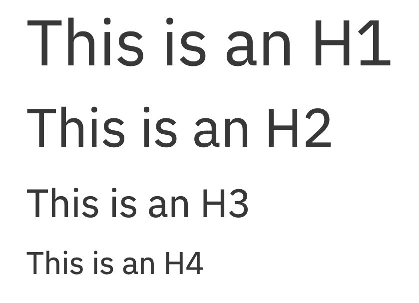
In general, headings should be short and to the point, and describe the content that comes next. Headings should never be used for style only, but always follow the correct structure. Finally, remember, headings can not be left empty and should not be on images.
Make Images Accessible
And what measures can we take to make sure that images, where there otherwise would not be text, are accessible to all? Users with vision impairment may not be able to see the images clearly and often use screen readers or other tools to read the alt text, helping them understand the content on the page.
To help, all images should have descriptive alt text. Alt text is the portion that a screen reader will read aloud for those with visual impairments. This text can usually be added in the media gallery, and should repeat any words in the image and give a brief description of the image.
If the image is linked to another page, it MUST have alt text which describes the linked page, such as the page title. All links must have discernible text, which does not include text as part of an image.
Choose Your Link Text Thoughtfully
Because screen readers are so commonly used by those with vision impairment, link text is always necessary outside of an image, and should always be descriptive of where the link is going. See the following examples:
Effective
Learn more about our organization’s history. Read our fact sheet to learn more.
Here, the user will know that the first link will take them to information about the history of the organization, while the second link will take them to a separate fact sheet. Furthermore, link text should never be the same for two different pages. In the effective example above, if there were more than one fact sheet, the link text for each would have to be different. For example, the writer can vary the text between “statistics fact sheet” and “nutritional fact sheet”.
Ineffective
To learn more about our history, click here. Read our fact sheet to learn more.
Having good, descriptive link text helps screen reader users know where the link goes. Usually, it’s possible for viewers to get a list of links on the page, which means that the surrounding context will not be available.
As a bonus, descriptive link text can boost both click through rates and SEO!
Select Colors with Sufficient Contrast
Low-contrast colors can create a major barrier for some users. Vision impairments such as poor vision or color blindness can prevent low-contrast text and images from being readable or even visible.
Color contrast must be at least 4.5:1 for small text or 3:1 for large text (you can check color contrast here). Large text has been defined in the requirements as 18pt (24 CSS pixels) or 14pt bold (19 CSS pixels). This rule also applies to interactive elements.
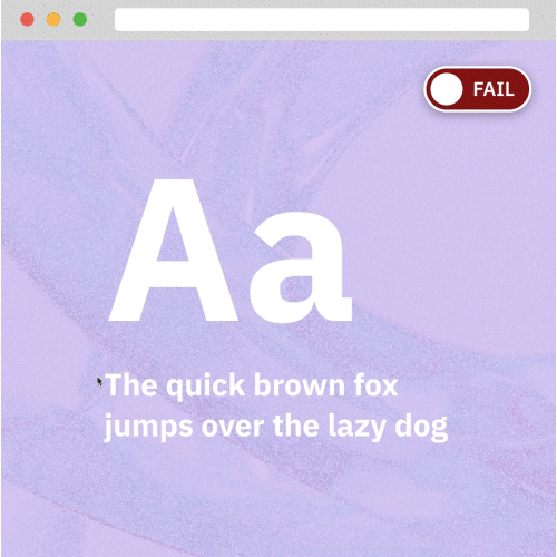
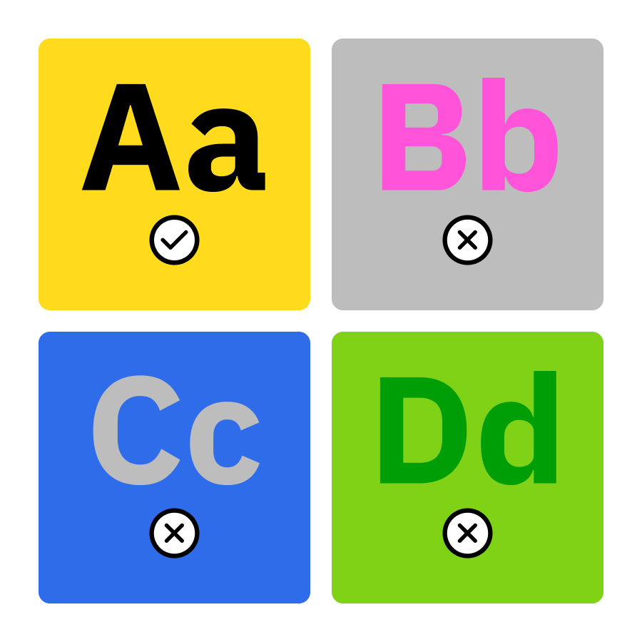
It’s best to simply not use additional colors in text content, beyond what is already existing based on your design (such as heading styles). If your design colors are already ADA compliant, then this will avoid any color contrast issues.
Put Inclusion at the Forefront of 2024
In this blog, we’ve summarized a few simple tweaks that you can make to your web content and design in order to ensure that your information is available to all. As we enter into the new year, we should all strive to be as inclusive as possible, with content that is accessible and entirely ADA compliant. The value of inclusivity is limitless!
These are all pieces of a larger knowledge base that we’ve developed throughout the years. If you’re interested in learning about any of the topics we’ve discussed in this blog, especially any more specific information about the tech side of it all, please reach out to us! We’re always available for consultation.
Like this post? Keep up with us on Twitter and Facebook.