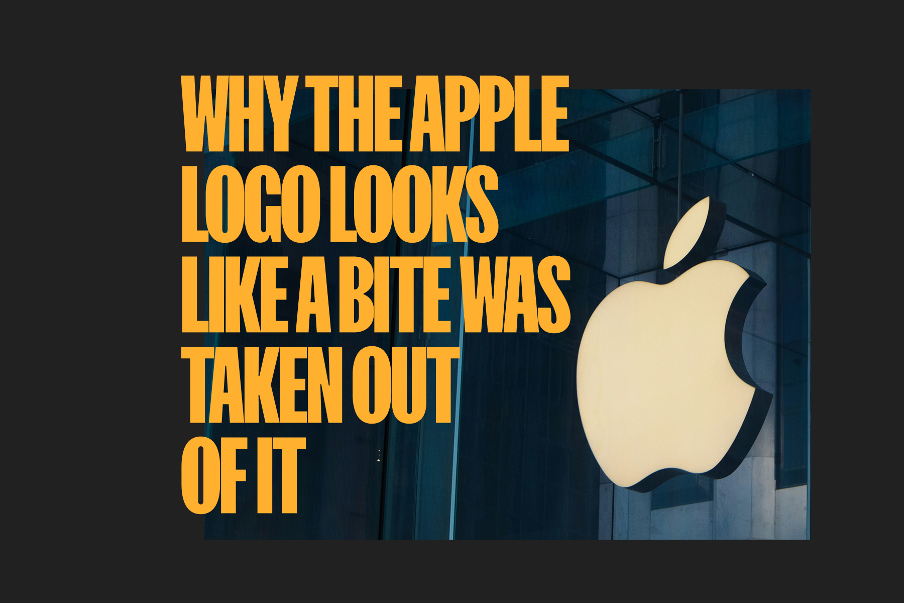
Why Does the Apple Logo Have a Bite Taken Out of It?
Spread the word. ❤️🔥
C’mon. I know you want to subscribe to our Email List.
Or Follow us on X and Facebook.
Why Does the Apple Logo Have a Bite Taken Out of It?
It’s a Choice. It’s a Vibe. And It’s Not What You Think.
Joseph Nother has been obsessed with Apple since before the agency’s founding. A self-proclaimed Xennial (digital upbringing, analog origins), he attributes much of Designsensory’s early success to the desktop publishing revolution that only Apple could spark.
So, when Reader’s Digest came calling for a definitive take on the history and symbolism of the iconic Apple mark, Joseph had to weigh in. We’re sharing his full breakdown below, because the truth about the logo is far more fascinating than the myths.
I’m Joseph Nother, co-CEO of Designsensory.
Fun fact: I’m roughly the same age as the Apple logo. At 20, I helped transform a boutique branding startup into what is now a nationally recognized integrated advertising agency; we’ll celebrate our 25th anniversary next year. Apple’s principles have guided Designsensory’s upbringing. To put a light on my Apple fandom, I have a pristine, complete set of original “Think Different” poster prints from the campaign that fueled Apple’s resurgence.
So yes, I felt compelled to weigh in.
Technology often asks us to take a bite of knowledge before we know the aftertaste. The Apple story sits right there. Curiosity first. Certainty later.
The Origin of the Brand
You can’t understand the bite until you understand the beginning. I always go back to the origin for clarity—and it starts simpler than you might expect:
- Start with the name and the first mark. Steve Jobs liked apples—simple as that. He grew up around the orchards of Cupertino and the Bay Area.
- The original 1976 “Newton plaque” logo by Ron Wayne shows Isaac Newton under an apple tree, the fruit poised to spark a discovery.
Why We See the Bite
The founding name is straightforward, but the logo itself is a complex piece of visual identity work. So, why the missing chunk? It’s part practical design mandate, and part accidental cultural lore.
- It’s a design necessity. Graphic detail is often added to clarify intent. Designer Rob Janoff has said the bite helps maintain and control the silhouette regardless of size (from social icons and small engravings to giant billboards) or treatment.
- It’s visual quirkiness. I’m a fan of details that add salience, which drives recall and connection. Graphic variation is often added to reveal personality.
- It’s the byte pun that stuck. Brands are in the business of myth-making. I’ve worked on programs where rationale gets retconned into the origin story to add depth and drama. Culturally, the wordplay bite/byte became memorable, even if it wasn’t the original brief.
The Anatomy of an Icon
Beyond the lore, the Apple logo is arguably the perfect brand mark. Does it work well? Absolutely. It achieves radical simplicity while retaining infinite meaning:
- Radical simplicity with high meaning density. One object; infinite recall. Easy reproduction. It can be engraved, embossed, or stitched and still work on any surface, physical or digital.
- It plays well in a system. Think of the treatments: the vintage rainbow, then chrome, glass, and matte black finishes. The format changes; the equity holds.
- Gestalt does its job. Law of Prägnanz, TLDR: the leaf and bite trigger instant completion in the brain, which releases a hit of dopamine.
The Choice We Keep Making
To close the loop on that opening idea: the bite feels like a choice we keep making with technology. We take a bite of the next thing, then learn what it changes.
That symbolism is why the Apple mark feels current and why it will continue to do so—so long as we value innovation and as long as they participate in that promise.
View the full Reader’s Digest article here: Why Does the Apple Logo Have a Bite Taken Out of It?.

