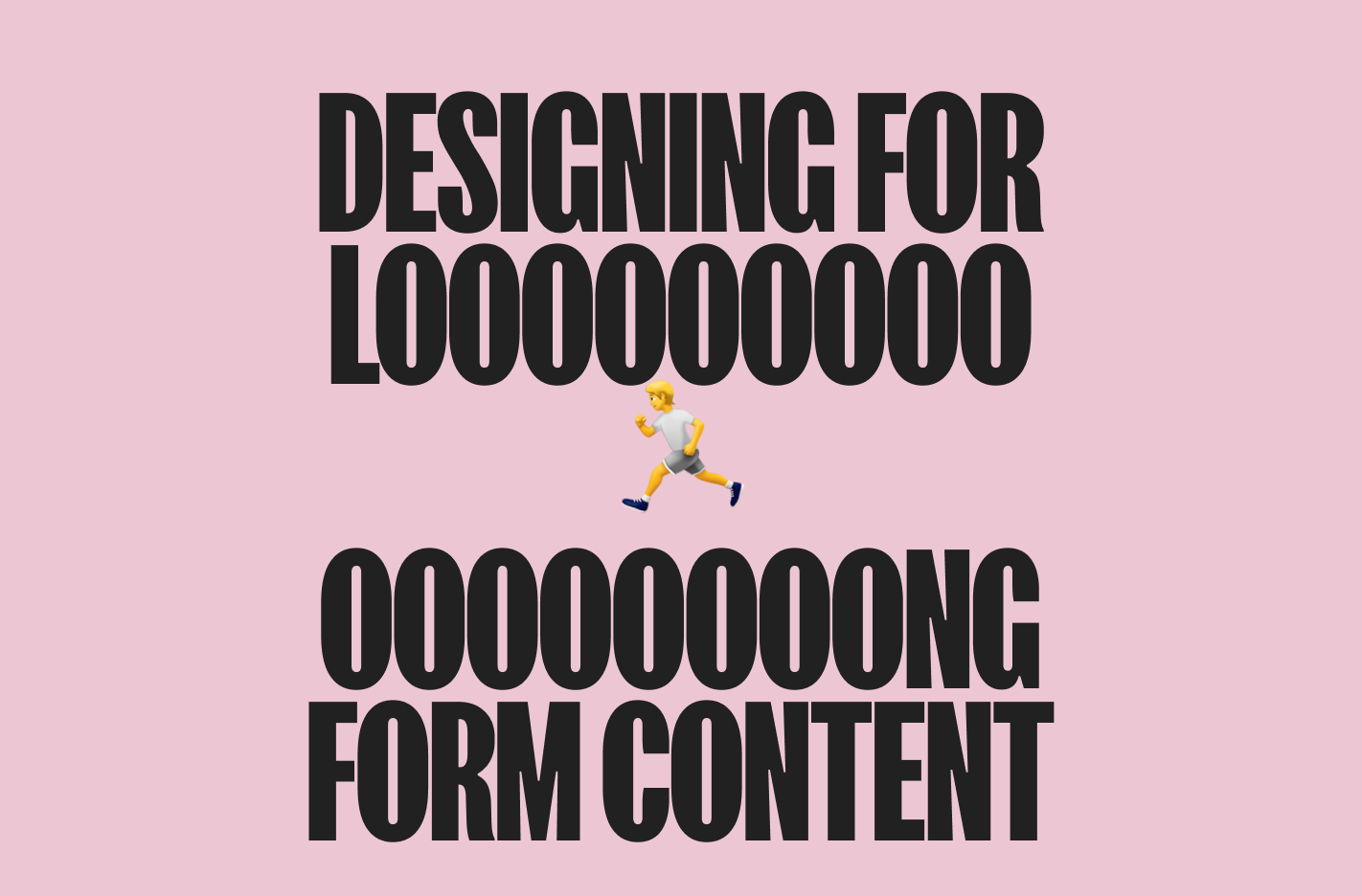
Designing for Long-Form Content: A Guide to Clarity and Usability
Spread the word. ❤️🔥
C’mon. I know you want to subscribe to our Email List.
Or Follow us on X and Facebook.
Designing for Long-Form Content: A Guide to Clarity and Usability
Designing websites packed with extensive information can feel overwhelming for both designers and users. Yet, long-form content serves a crucial purpose: it delivers essential answers quickly and comprehensively. The challenge? Keeping it clear and promoting swift scanning. Here’s how to make long-form content work seamlessly, ensuring both engagement and ease of use:
1. Table of Contents and Back-to-Top Navigation
Humans excel at categorizing data, and when faced with large volumes of information, sectioning it off improves comprehension and retention. While many of us may have ignored the Table of Contents (TOC) in our high school textbooks, on the web, TOCs are a game-changer.
- Provide an Overview: Anchor-linked or sticky TOCs offer users a quick snapshot of your page’s structure, minimizing endless scrolling. They act as a roadmap, allowing users to jump directly to the content they need.
- Enhance Usability: If your TOC isn’t sticky, make sure there’s a prominent “Back to Top” button for effortless navigation, particularly on long pages where scrolling can become tedious.
- Optimize for Mobile: On smaller screens, prioritize real estate by evaluating which elements must remain visible. A collapsible TOC or a simplified menu system may work better to maintain clarity without crowding the interface.
Incorporating these navigation aids ensures a seamless experience, reducing frustration and enhancing user satisfaction.
2. Bulleted and Numbered Lists
They’re all over the place for a good reason: they work. Bulleted and numbered lists enhance readability by:
- Boosting Scanability: Break down dense text into bite-sized, digestible chunks that are easy to skim.
- Improving Organization: Lists create a natural hierarchy, guiding users through key points effortlessly. This makes it easier for readers to focus on what matters most.
Stick to simple and effective formatting to keep your lists clean and impactful. Consider supplementing lists with icons or small visuals to draw attention to specific points and make the content even more engaging.
3. Thoughtful Use of Design Elements
Accordions
It’s tempting to tuck everything away into accordions, but tread carefully. Extra interaction costs mean users have to work harder for information. Use accordions for:
- Supplemental Content: Provide additional details users may want to explore at their own discretion, such as FAQs or extended explanations.
- Clear Labels: Ensure headers are concise, descriptive, and intuitive to reduce confusion.
- Minimized Animations: Don’t overwhelm users with flashy open/close effects; simplicity is key to maintaining a professional aesthetic.
Cards
Cards can be an excellent way to highlight information but use them judiciously. Ask yourself:
- Does it Need a Visual Callout? If the content isn’t vital, it may not warrant a card. Overusing cards can clutter the interface and dilute their impact.
- Would Another Format Work Better? Could the information be better presented as a bulleted list or a table for easy comparison? Tables, in particular, are ideal for presenting data that requires side-by-side evaluation.
Thoughtful use of these elements ensures clarity while maintaining an engaging and visually appealing design.
4. Prioritize Accessibility
Design inclusively to accommodate users with diverse needs. For example:
- Color Contrast: Use high-contrast color combinations for text and backgrounds to improve readability for visually impaired users. This is essential for compliance with accessibility standards.
- Alt Text: Include descriptive alt text for all images to enhance navigation for screen reader users and improve SEO.
- Keyboard Navigation: Ensure all interactive elements are accessible via keyboard shortcuts, catering to users with mobility impairments.
This approach not only broadens your audience reach but also demonstrates empathy and commitment to inclusivity. Accessible design benefits everyone, fostering a more welcoming digital environment.
5. Maintain Consistency
Consistency in design fosters trust and creates an intuitive experience. Ensure:
- Uniform Styling: Use consistent fonts, headings, and spacing throughout your site to create a cohesive look and feel.
- Predictable Interactions: Keep navigation patterns and design elements familiar to reduce cognitive load. Users should never be surprised by unexpected behavior or inconsistent layouts.
- Brand Alignment: Consistency also extends to visual identity. Use colors, typography, and imagery that align with your brand to reinforce recognition and credibility.
Consistency simplifies navigation, improves user retention, and enhances overall satisfaction.
6. Establish a Clear Visual Hierarchy
Guide users through your content by creating a logical flow. Achieve this by:
- Font Sizes and Weights: Differentiate headings from body text to draw attention to key sections. Use bold text sparingly to emphasize important points.
- Spacing and Color: Use whitespace strategically to separate content blocks, making the page feel less cluttered and more inviting. Subtle color changes can also help delineate sections.
- Imagery Placement: Place visuals near relevant text to support comprehension and break up large blocks of text.
A strong visual hierarchy helps users process information faster, increasing engagement and reducing bounce rates.
7. Optimize for Mobile Devices
With a significant portion of users accessing content on mobile, responsiveness is critical. Ensure:
- Adaptable Layouts: Design layouts that adjust fluidly to various screen sizes. Use responsive grids and scalable assets to maintain visual integrity.
- Touch-Friendly Elements: Make buttons and links easy to tap, avoiding crowding. Ensure touch targets meet minimum size recommendations for accessibility.
- Streamlined Navigation: Use collapsible menus and simplified TOCs to prioritize mobile real estate. Avoid overwhelming users with too many options at once.
Test your designs on multiple devices to ensure a consistent and enjoyable experience for all users.
By prioritizing accessibility, consistency, thoughtful navigation, and strategic use of design elements, even the most intimidating long-form content can transform into a seamless, user-friendly experience. Design with purpose, test relentlessly, and you’ll create sites that not only look great but function flawlessly. Embrace these best practices to deliver content that resonates with users and stands the test of time.
Need help taking your web design or user experience to the next level? Get in touch to collaborate with our experts. Let’s create something exceptional together!

